
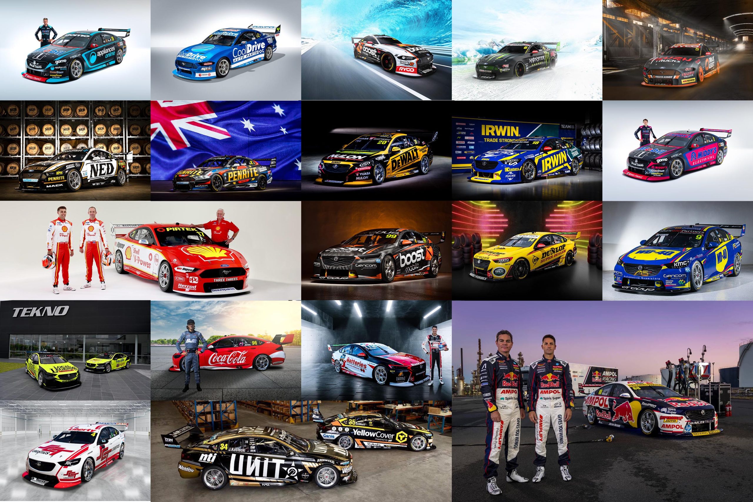
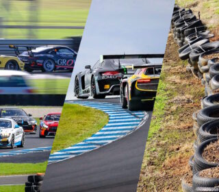
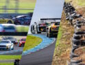
POWER RANKINGS: ’21 Supercars liveries
THE POWER RANKINGS are back. TRT’s not-so-patented ‘Hot or Not’ wrap of any given motorsport activity is back for the new year.
If you’re new to it, it’s pretty simple. Along with our great friends who follow TRT on our social media channels, our team and a group of unnamed, top-secret contributors put together their thoughts from each round and they all get compiled into this one big wrap of what’s good and what perhaps needs some work.
We’re keen to be the bastion of truth and honesty in the sport so if something needs some work, we’ll call it – without resorting to the kind of rubbish you’ll find on most parts of the internet (at least back when Facebook was a thing..).
So, that’s the Power Rankings. We thought we’d get things rolling for the new year by picking apart the field before they even turn a lap…
Also and for the record; We’re purely rewarding aesthetics here. If a team has a cluttered livery because they’ve signed a billion new sponsors then that’s great. But if it makes the car look average, so be it.
HOT
BOTH WAU CARS
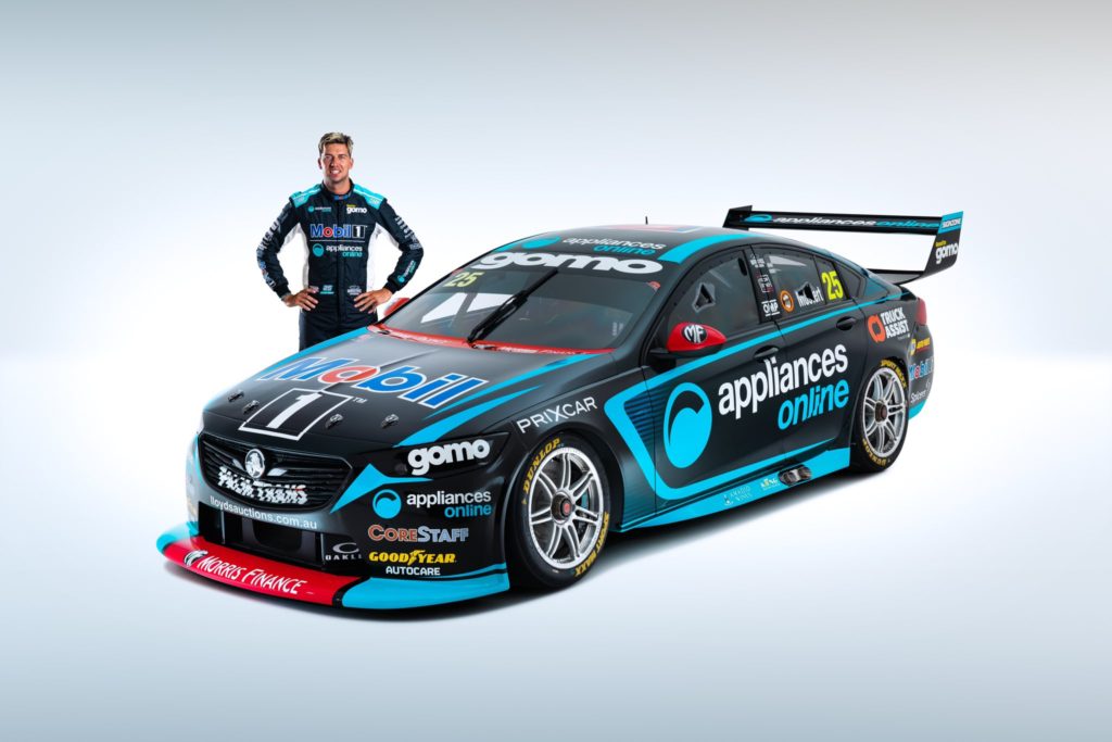
Simple, clean, striking and bold. We rate them both. WAU are the only team to have actually moved the livery game forward this year, with something truly new and fresh and they get absolute top marks. Chaz’s car is simpler, Bryce’s brighter and a bit busier, but both work. Can’t wait to see these on track.
COOLDRIVE RACING
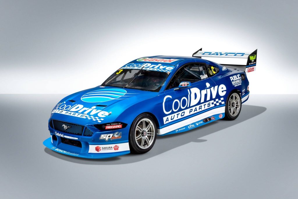
Always a classic, goes to another level on the beautiful, Blue Mustang this year. This livery could’ve been from 1994 it’s so clean and simple, ditching the logo motif from the sides has worked a treat. Stunning.
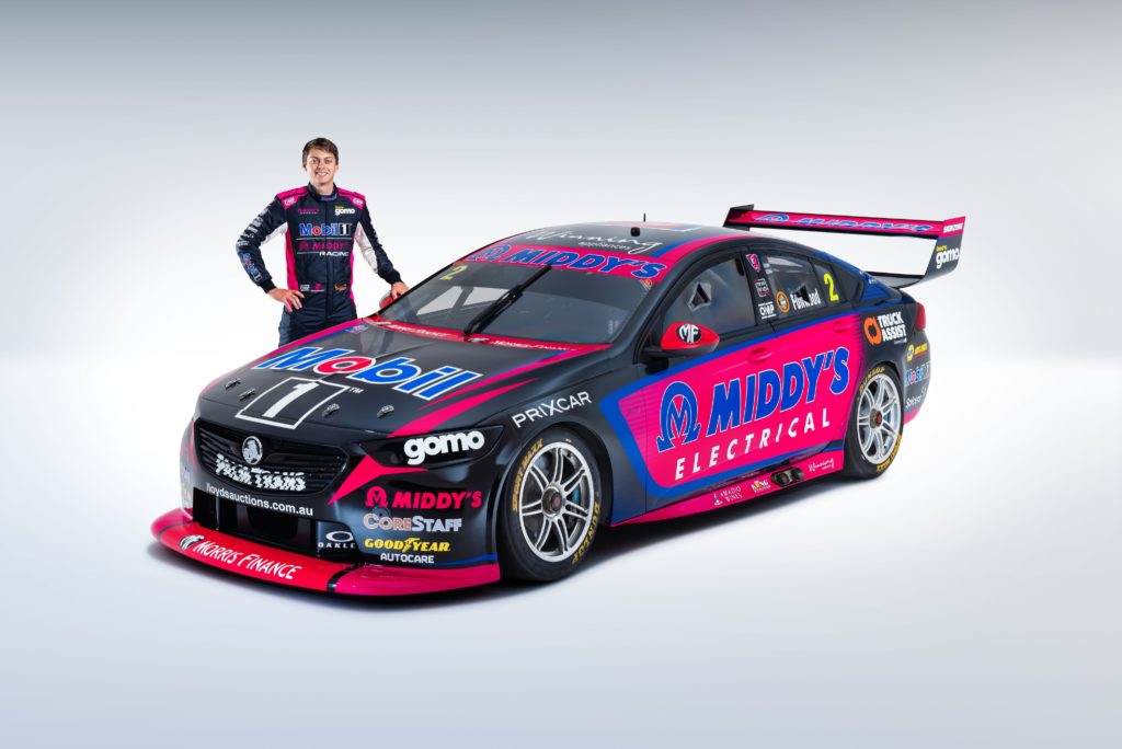
EREBUS MOTORSPORT
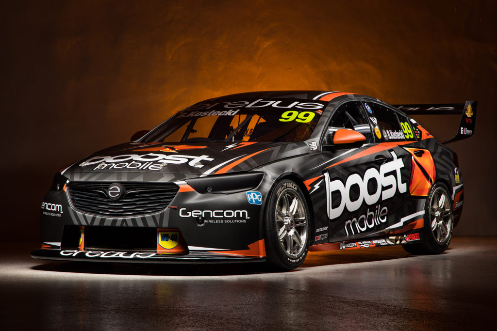
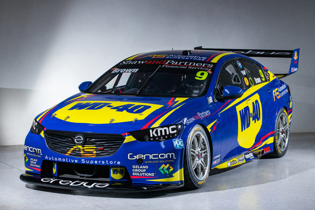
Lots of argument over this, but Kostecki’s Boost car is good, and the WD40 livery on Will Brown’s car got the pass mark, too, mainly because editor Craill loves the smell of WD40 more than most things, and won’t hear any arguments to the contrary. Their testing livery was pretty cool, too, and we like the details in the Boost car that carry that over. A solid effort from the refreshed Erebus.
IRWIN COMMODORE
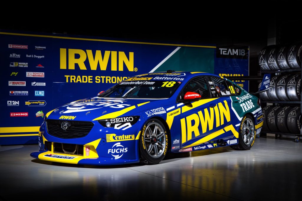
Less yellow works nicely, and the Bunnings branding slots in well. The green and blue is somewhat reminiscent of Steve Richards at FPR in 2009. Also, getting the subsidiary sponsors to play the game with colours is most helpful. Another one that polarised the group, but snuck into the top tier because it’s hard to bugger up an IRWIN livery anyway.
TRUCK ASSIST MUSTANG
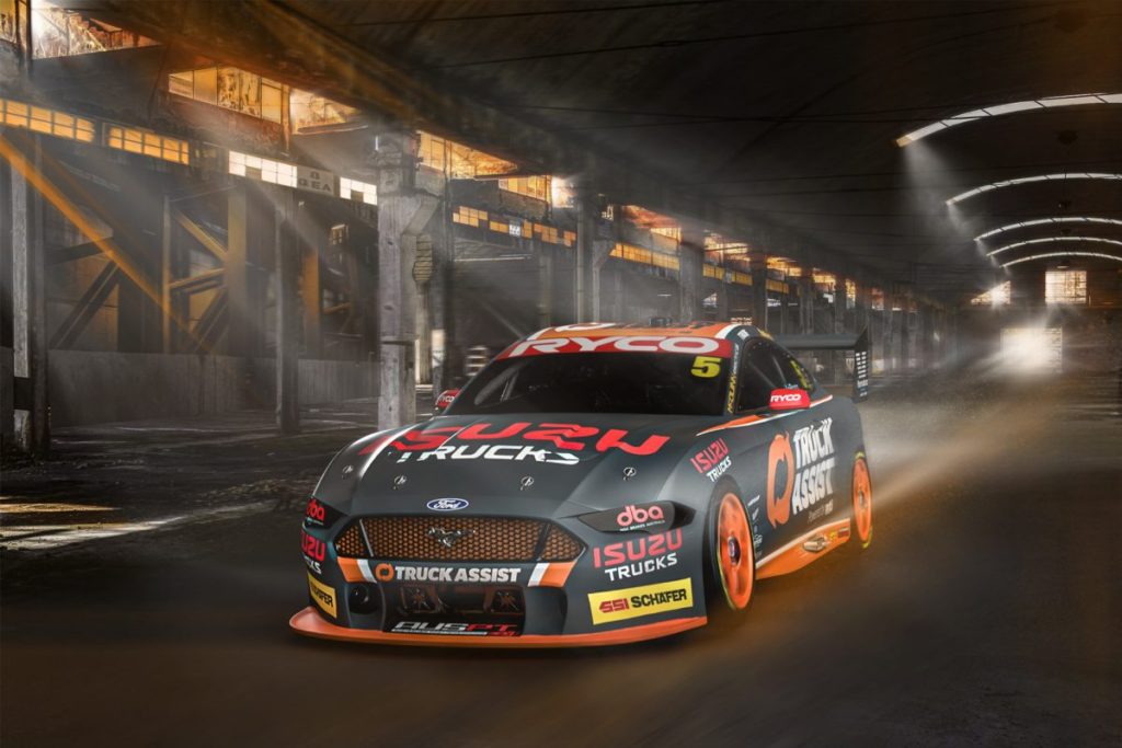
You simply can’t get a livery that just happens to include TRTs corporate colours wrong. So simple. So good.
‘MEH’
A new category for this column alone on the basis that our regular third criteria of ‘What’ didn’t really fit. It’s not a black mark to be in this group – many of these liveries were voted ‘Hot’ by the group, but for many and varied reasons, didn’t quite make the cut..
DICK JOHNSON RACING
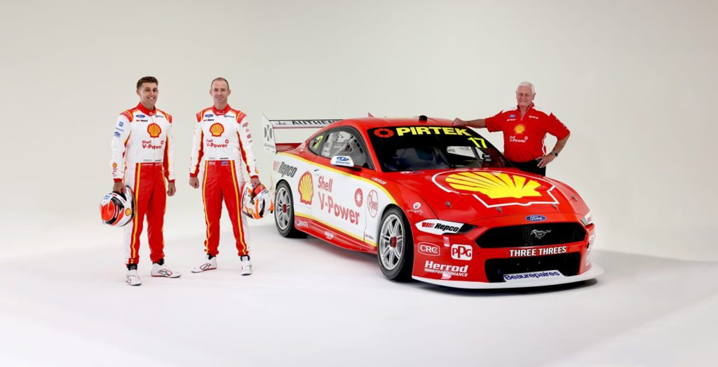
There’s absolutely nothing wrong with this livery. It’s clean, clear, good for branding and looks great. It’s very like a Penske-influenced team to keep the same scheme since the start of 2017… But it’s position here indicates our panel feels like it’s lost its ‘wow’ factor.
MONSTER FORD
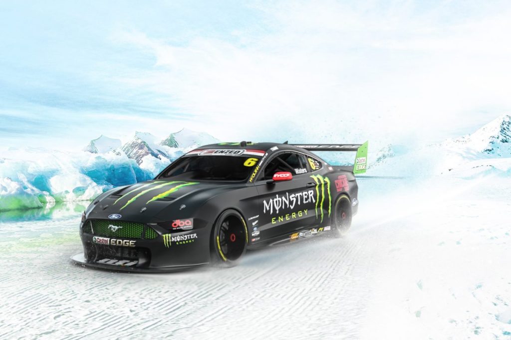
Look, it’s effective, but at the same time, there’s only so many takes on the matte black and green theme year on year. Why not try it in reverse? Might be against corporate branding guidelines, but it’d sure work..
PENRITE MUSTANG
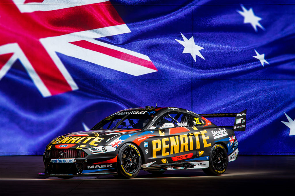
This is a difficult one. Is it hot? Is it not? Too hard, so it’s sitting here in purgatory. A definite improvement over the dog’s breakfast served up last year, but there’s still a lot going on. Maybe it will look great if it’s a strong performer on track? It’s funny how that works…
DeWALT COMMODORE
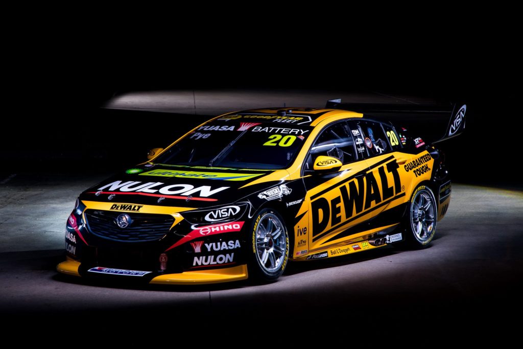
Imagine this colour scheme, but in the 1995 Winfield Racing Commodore design. See what we’re saying? It’s good, but with less stuff it could be great. Not less sponsors.. just less.. angular bits and pieces. Richmond Tigers fans probably disagree, but that keeps it from greatness.
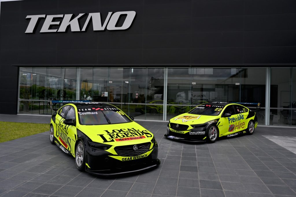
COURTNEY’S BOOST
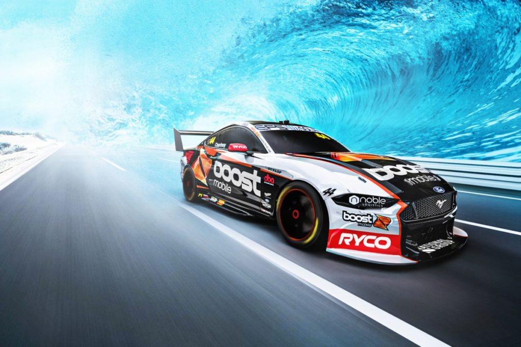
It’s pretty good, but Brodie’s Boost Buggy shows what the brand is really capable of.
DUNLOP RING-IN
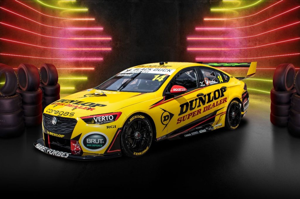
Look, it’s good, but it’s another livery that we’ve seen wheeled out over the years, albeit for one event at a time. Maybe we’d feel more warm and fuzzy about it if it were to be a permanent fixture on the grid?
MATT STONE RACING
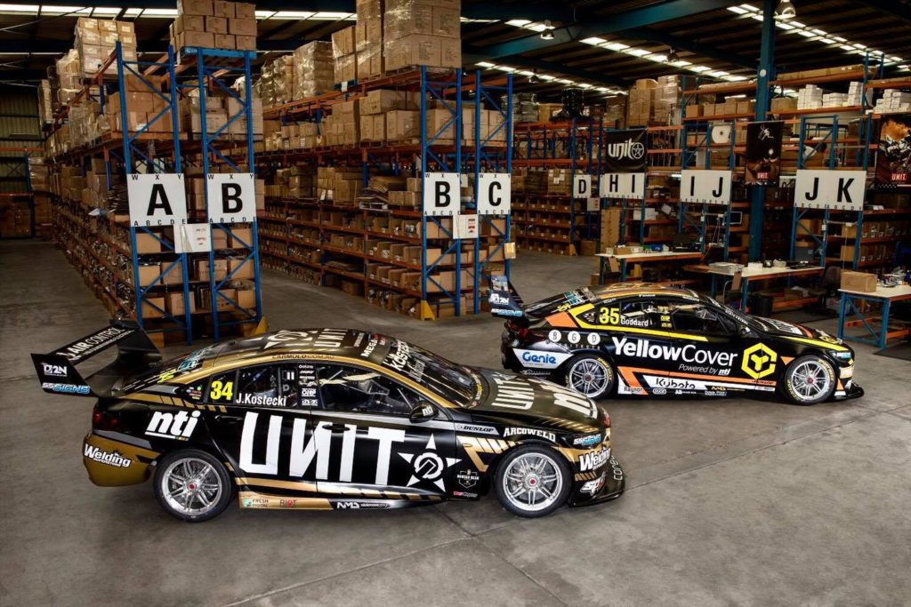
There is an awful lot going on with this pair. They aren’t offensive, but at the same time, they are busy. The Unit effort from Bathurst last year was an improvement over the 2021 version.
Meh. That is all, that is the caption.
FABIAN’S COMMODORE
VERY bright and simple but we think the limited palette kinda works here. Any more stickers on the car and it’d look cheap (see just below..), but you’ll never miss this one in the field. Less black on the 2020 iteration was preferable.
NOT
GARRY’S COMMODORE
Remember when the privateers would rock up with a white Commodore with random stickers from their mate’s companies all over them? Back then it was endearing and the battler privateer spirit. This looks like a high-vis jacket crashed into a signwriters shop, or the result of copying the other kid’s homework, but not changing it enough to avoid the focus of the teacher.
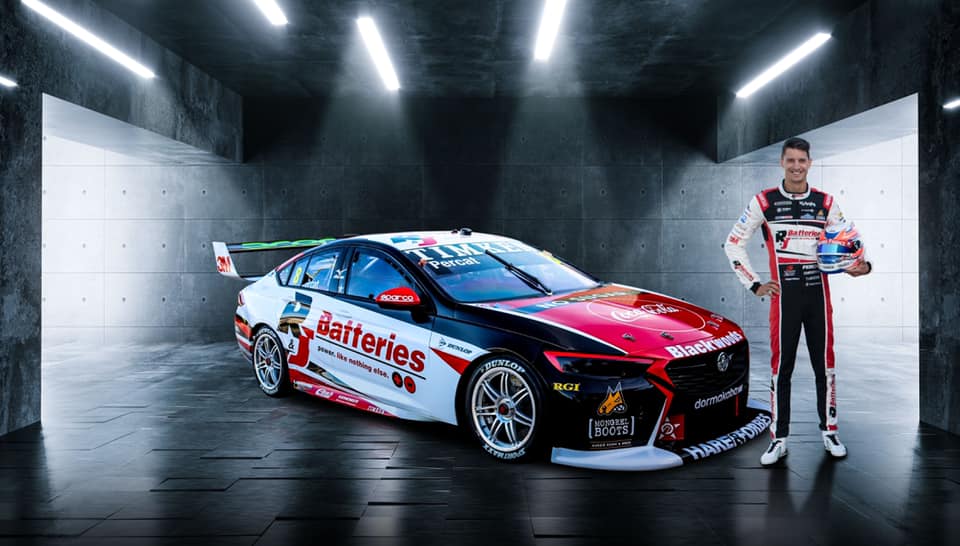
SMITH’S COMMODORE
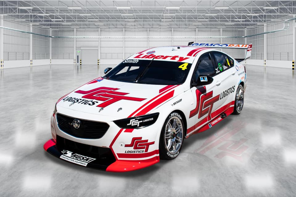
A throwback to the days when company reps were issued with a white Commodore. Cleaner than last year, but it’s a bit boring, isn’t it? Surely with this scheme you could do so much more.
RED BULL AMPOL RACING
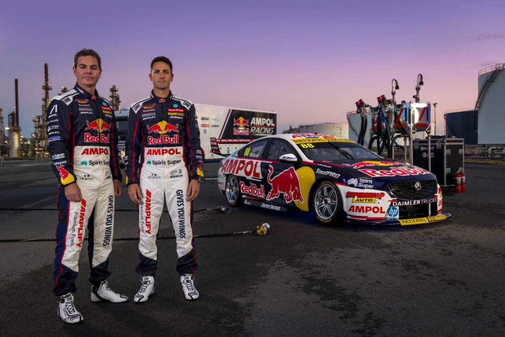
Ohhhhh, controversy! We can feel the keyboards starting to warm up now! But before you fire up, this isn’t a slight on Triple Eight – their remarkable commercial success has come at the price of a clean livery. When you have all the sponsors in the world, you’ve got to have somewhere to stick them. So the team has plenty of backing, but a cluttered and busy car and that’s why they are here. For instance, the word Holden didn’t quite fill out the rear quarter as much as the word Ampol. We hope they take it as a (perhaps slightly backhanded) compliment…
THE COKE MACHINE
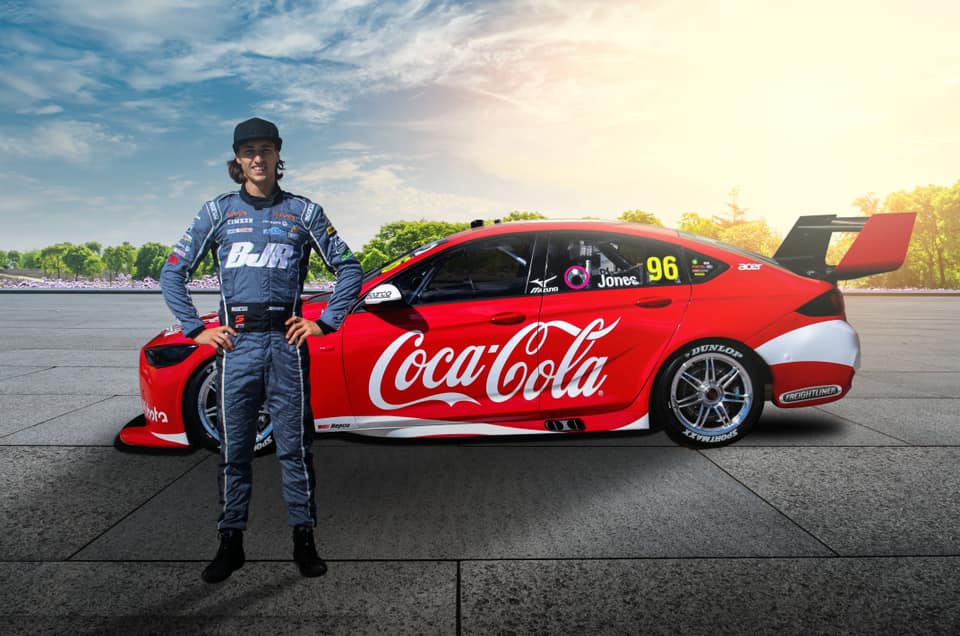
This one will divide opinion, we are certain. It’s very plain, isn’t it? It wouldn’t take a lot to make it pop, but the low key, one-tone dynamic ribbon device, isn’t much. A slight tweak could result in a super-hot, off the charts effort.
NED MUSTANG
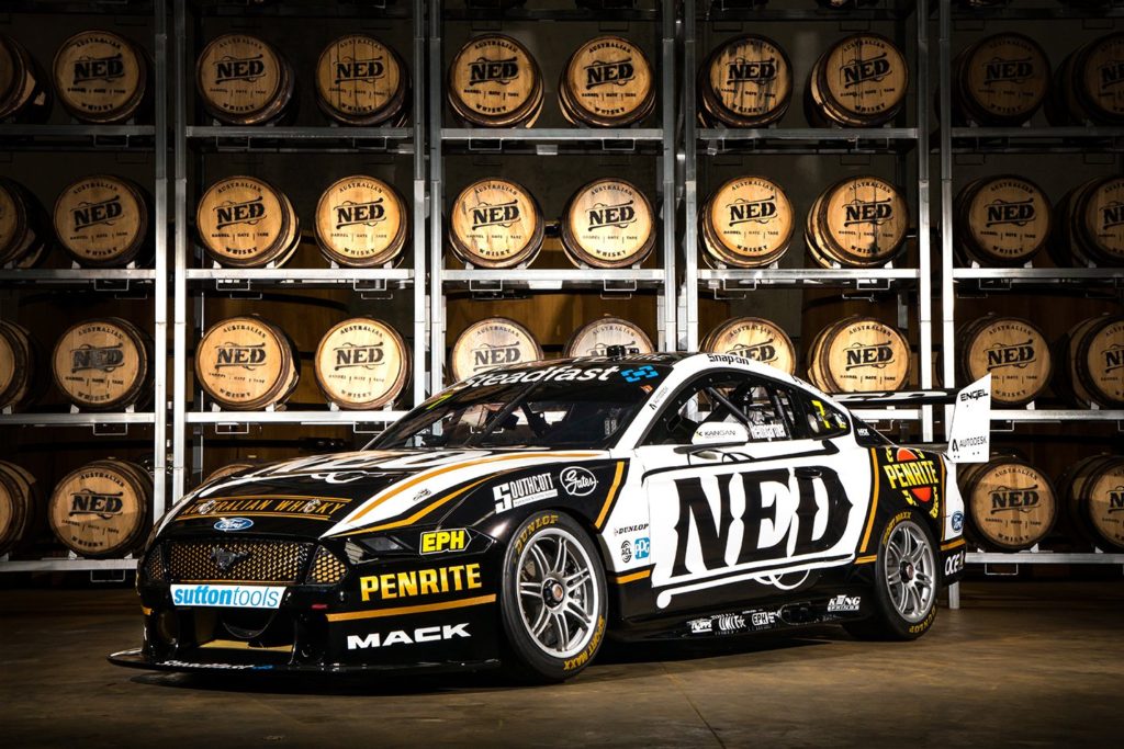
Another victim of its own success, the addition of more branding, more Penrite, and more black stickers is a good thing for the bank balance at Kelly Grove, but it’s a step back in terms of the aesthetics of their 2020 effort. The NED on the side appears to not be talking the same language as the stickers on the front guard.
