

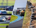
DORIC POWER RANKINGS: 2022 Liveries
IS THIS, broadly speaking, the best lot of Supercars liveries we’ve seen for years?
Or has the field taken a retrograde step from 2021?
To find out, we’ve put the 2022 field under the microscope of the only thing that can possibly determine the Hot from the Not: Welcome to a special liveries edition of the patented Doric Power Rankings.
These rankings will be a little different. Because they are often a personal thing, we had full blown arguments in TRT HQ about what should be in each category – about the only thing we agreed on was that there is no place for lightning graphics on a racing car – so instead, Craill & Walker have given their own rankings to each livery.
We’ve even thrown in some side-by-side comparisons to 2021 to make the job even easier harder.
What do you think? Hit us up on our socials via @theracetorque and let us know!
CHAZ MOSTERT’S OPTUS COMMODORE
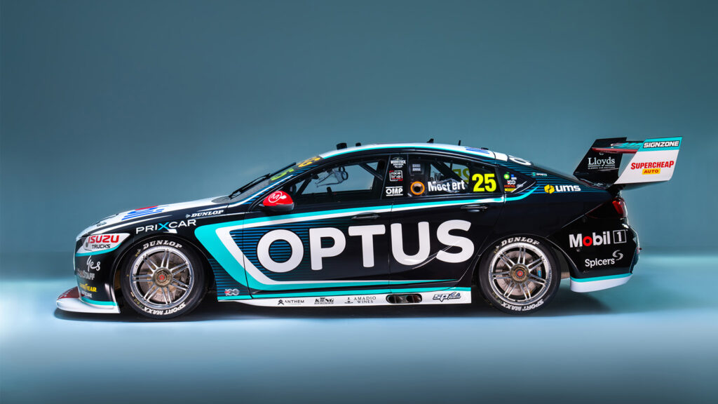
CRAILL: HOT – WORKS better than the Percat car thanks to the flashes of Optus light green and the blue in the side panels, and like Percat’s car the flashes of Red help elevate this. Perhaps the more successful of the two WAU cars and continuing the theme of less clutter and more simple branding in 2022.
WALKER: Yes. I mean HOT. PROBABLY THE PICK of the litter, again. Optus is big and bold and certainly fills the sides of a Commodore, however, expect that blank rear quarter panel to get filled. Interestingly, NAPA has been subbed out for SuperCheap. The big question is – is it as good as last year’s livery? Twelve months ago it topped the pops on this column, and the rose coloured glasses of a Bathurst win certainly make the 2021 version a memorable one…
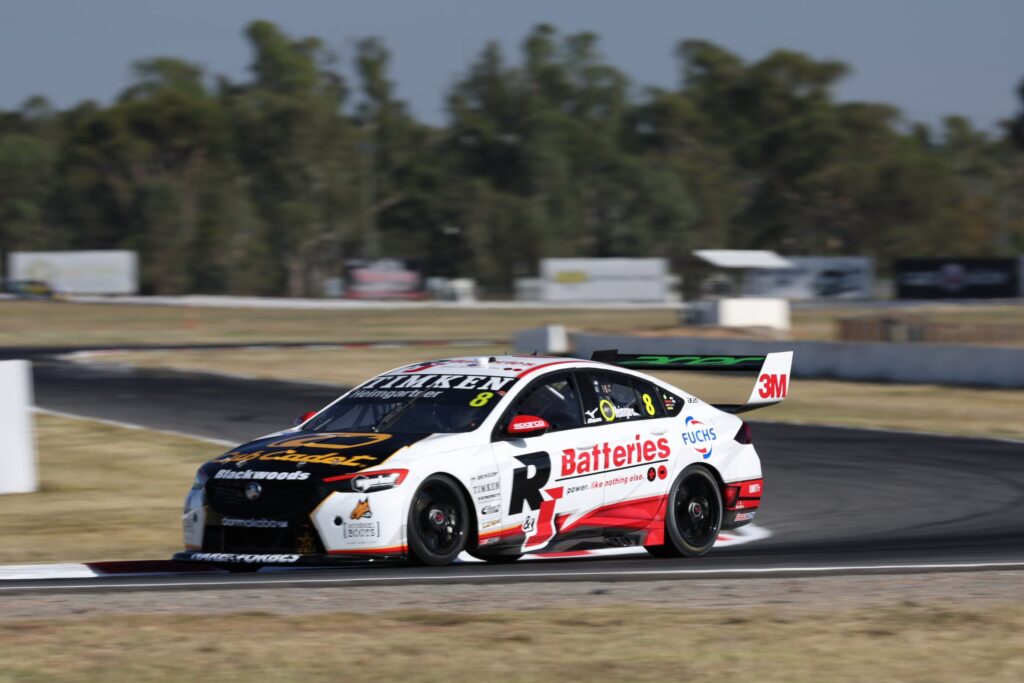
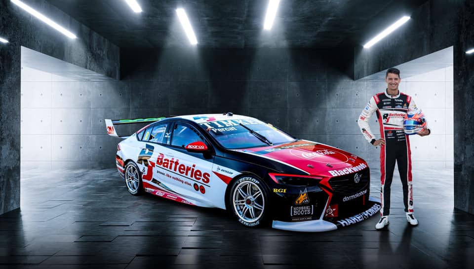
NICK PERCAT’S NTI COMMODORE
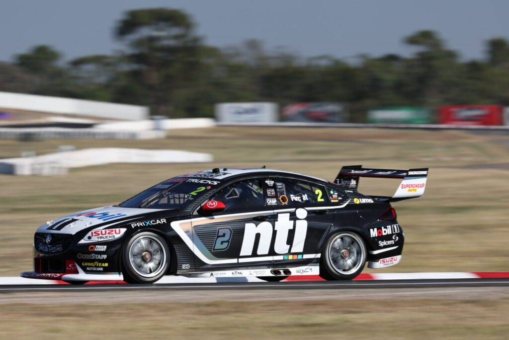
CRAILL: I don’t know how to feel so I suppose that means WHAT, but it’s almost HOT… – A CLEAN and simple design that brings back the door numbers, but after Bryce Fullwood’s in-yer-face car at WAU last year, is this black, grey and white design just a bit too conservative? The flash of Red on the front splitter, though, works well with the Mobil 1 on the bonnet to evoke the old HRT days, so that’s a bonus. Big NTI graphic leaves a lot of side space though.
WALKER: Fairly HOT. I THINK I would have to reserve judgement until I see it in the flesh. Black and white are a bit plain Jane, but it does offer the ultimate in contrast, a concept some other liveries battle with. People bang on about how wonderful it is that the car has a dirty great number two plastered on the front door – but frankly, it does zero for me. Numbers pay very little rent to be on race cars, and it’s only there because the acronym NTI is only two and a bit characters long, and doesn’t fill out the rectangular envelope as Optus does.
TRUCK ASSIST RACING with MSR
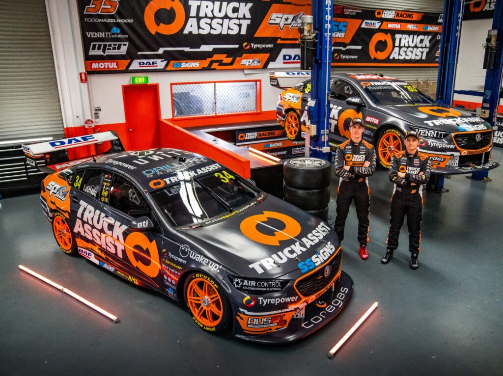
CRAILL: Almost HOT – VERY hard to stuff up a Truck Assist livery and by no means have MSR done the dirty to the Dark Grey and Orange here. It’s just not as clean as, say, JLB’s Tickford Mustang last year thanks to all of the extra commercial support this Queensland team has gained. Not terrible by any extent, just very busy, which is why it sits here on the cusp of being great.
WALKER: Pretty HOT. IT’S A DEFINITE step up over the dog’s breakfast served up by Matt Stone Racing last year. Is it better than last year’s Truck Assist effort? It does suffer a bit of clutter from the patented Matt Stone Racing subsidiary-sponsor-itis, but the Truck Assist on the bonnet works much better than the previous Isuzu red on grey, which didn’t convey well in moving or still images.
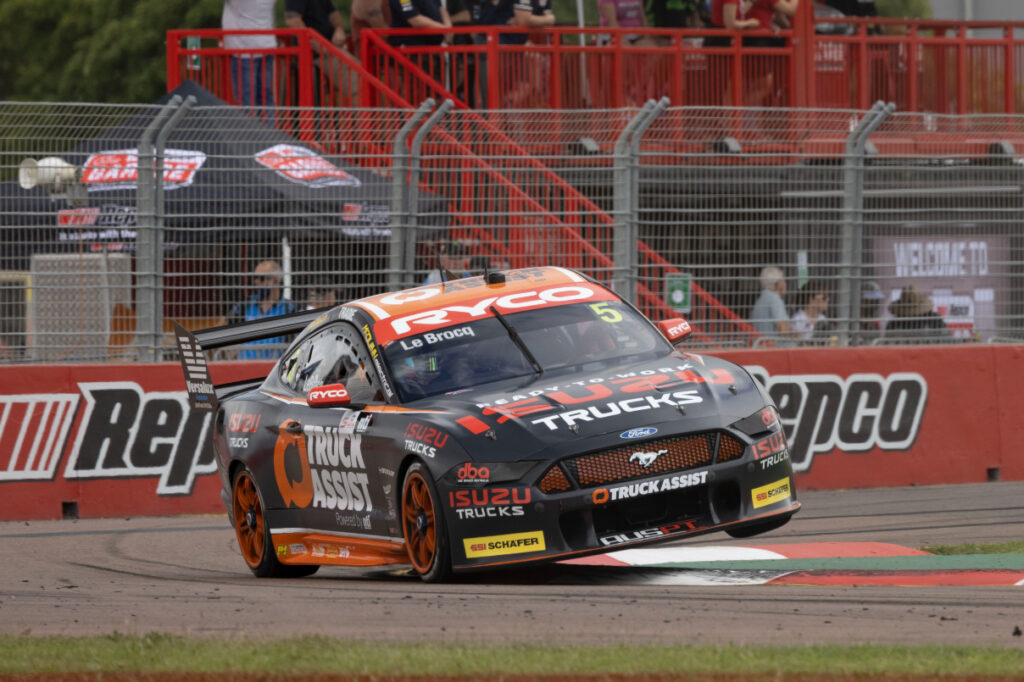
JAKE KOSTECKI’S TRADIE MUSTANG
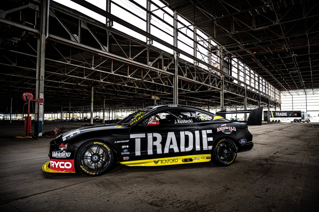
CRAILL: HOT – I AM GOING to give this one a ‘Hot’ but I had to think about it for a long time. Ultimately, the simplicity of it won out for me. Remember the 1990s, when liveries were one or two main colours, in a simple design and without being festooned with a host of different minor sponsors? Well, this one has the minor sponsors but otherwise this is a nice, simple livery and I’m here for that these days. PS – Imagine how sick it would look if that red Ryco strip ran along the side of the car above the yellow? C’mon Tickford, get it done!
WALKER: HOT – DO YOU REMEMBER how everyone started frothing around Retro Round time when all of the really simple old school liveries would get wheeled out? Consider this one a throwback to a 1992 livery that never actually happened. Here’s a tip for young players – the whole point of sponsoring a racing car is that people see your logo. Burying your logo in a sea of complex livery bells and whistles might look nice on paper, but it takes the focus away from your end goal. Otherwise, I am a deadset sucker for yellow on a black race car, it’s my main weakness. Like Optus, the dimensions of Tradie sit in the space nicely. It’s big, it’s bold, you know it’s sponsored by Tradie, which hopefully shifts some Tradie units. For Tradie.
MACAULEY JONES’ BJR COMMODORE
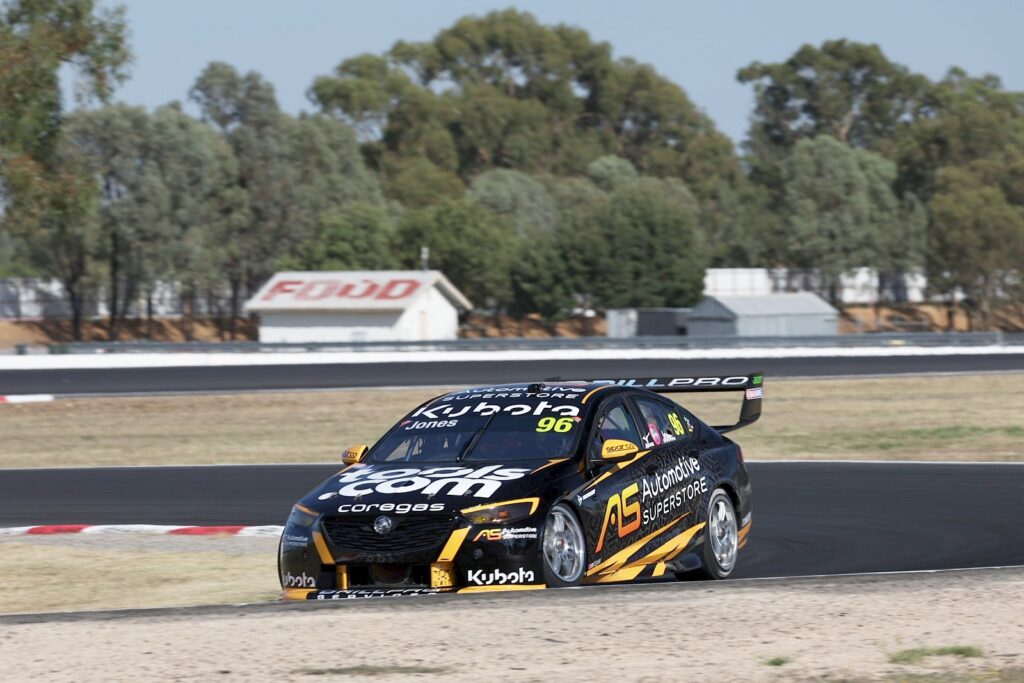
CRAILL: NOT, but reasons – WAS there a runout on Black and Orange vinyl this year? Another variation on a theme: Inoffensive and doesn’t leap off the page which is why it gets relegated to the NOT section in the end. It’s not terrible, but liveries should blow your branding off the car so everyone can see it and I’m not sure this one hits the mark. Little silver detailing on the front bar and behind the side signage is a nice little detail addition but will almost certainly get lost on TV at 290km/hr.
WALKER: Pretty HOT. READ: DIRECTLY ABOVE regarding my soft spot for bumblebee liveries. Unfortunately, Automotive Superstore contains many letters, so they aren’t capable of making it overly bold. Also, depending on the image, the graphic whackiness behind the logo on the side can be slightly overpowering. Still, it would be ace if it hung around for longer than two rounds.
TIM SLADE’S COOLDRIVE MUSTANG
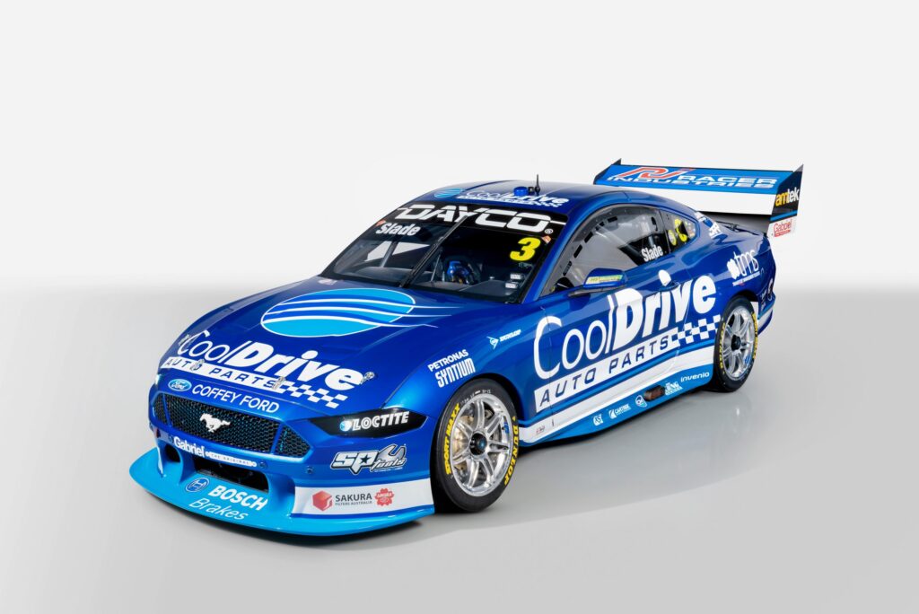
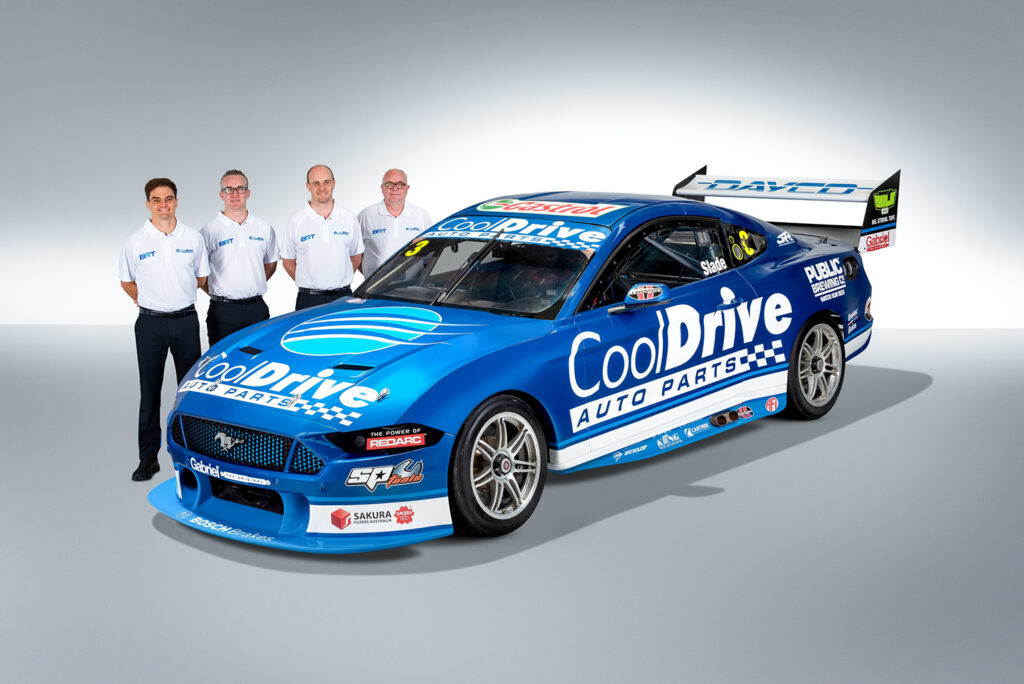
CRAILL: HOT – A CLASSIC last year and the little tweaks this year make this stunning blue beast even better. One of the prettiest cars on the grid with a simple, bold, effective and stunning livery.
WALKER: HOT – COMPARE AND CONTRAST: new on the left, old on the right. Spot the differences? After the success of the first year, more companies have jumped on board for season two, and good on them. It doesn’t ultimately change the balance of the look too much, which is nice. Maybe a little graphical birthday for next year to keep the hot-trot going?
CHRIS PITHER’S COKE COMMODORE
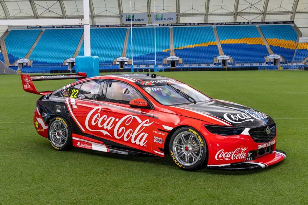
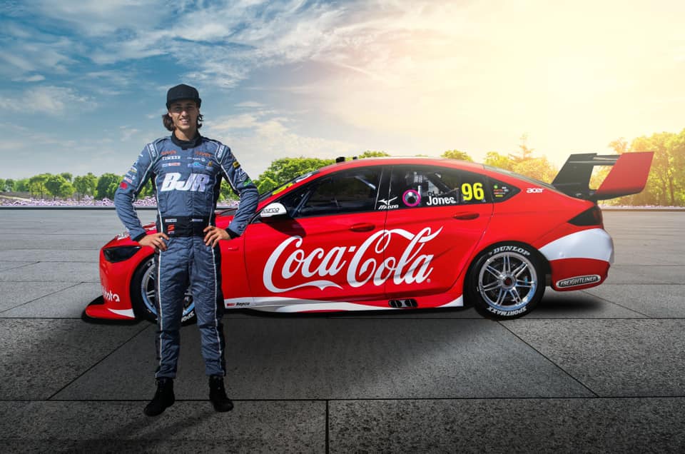
CRAILL: HOT – HARD to stuff up a Cokeadore and this is more of the same. The same livery / different colours thing with teammate Jacobson works well and gives this new team an identity despite having two different liveries. Not as clean and simple as Macca’s from 2021 but then there’s a bit more signage on this car to work with..
WALKER: PRETTY WARM. WOULD ANYONE else like to see what a Wayne Gardner Coke scheme from 1995 would look like on a new age Commodore? A definite step up from the BJR attempt of 12 months ago, but it’s always easy to make a livery pop if you don’t have multiple sponsors to jigsaw onto the machine. For the team’s sake, hopefully, some of the emptiness is filled in as the season progresses.
SCOTT PYE’S TEAM 18 COMMODORE
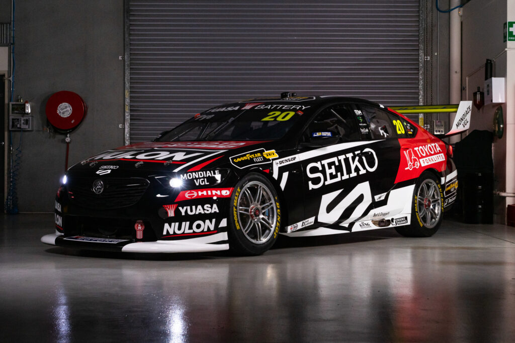
CRAILL: WHAT – I ACTUALLY like the livery, it’s clean and effective and good on Seiko for jumping on board to fill the void left by DeWalt. Clearly difficult times for Team 18 though and a rotating cast of sponsors, Brad Jones style, looks to be the way forward.
WALKER: HOT – THREE COLOURS, big contrast, and it all just seems to slot into place, which I’m here for. Like Macauley Jones, I’d probably appreciate it more if it were here for the long haul.
PENRITE RACING
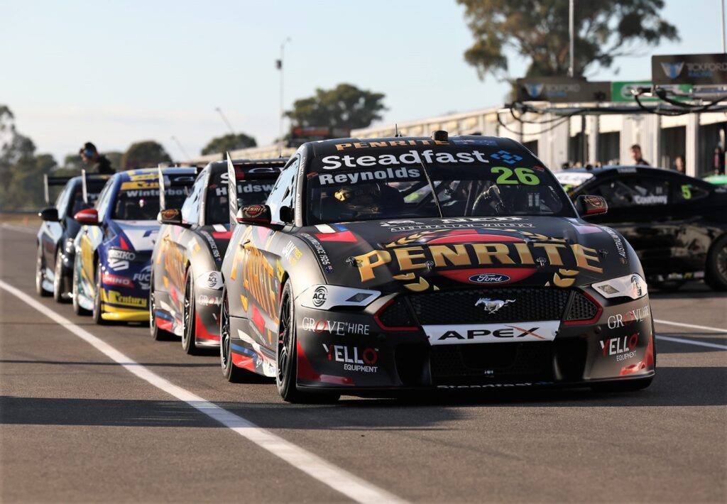
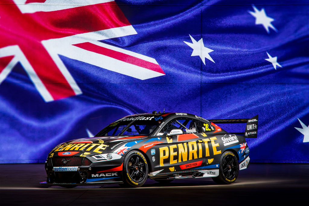
CRAILL: AMBIVILENT – Penrite have always have pretty good liveries that look pretty good on the cars that they are applied to. The branding stands out pretty well and they’ve worked hard to add in all the sponsors the team appears to have, so that’s good on them. But in the end it’s another Penrite Livery like most of them before it. It doesn’t shout “WOW” but it’s not at all offensive either. Good to see it on two cars, though. And don’t @ me for the new category, it’s my rankings and I can do what I like.
WALKER: WHAT’S ANOTHER WORD FOR AMBIVALENT? I DON’T WANT TO STEAL RICHARD’S WORD. MAYBE I WOULD like it more in the flesh? It’s having a big swing at a livery and there is a fair degree going on… I love this country, but does the Australian flag really have to be in there? New on the left, old on the right, and I really don’t know how to feel about either.
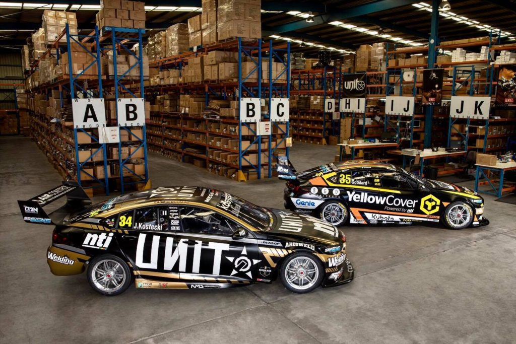
GARRY JACOBSON’S SUBWAY COMMODORE
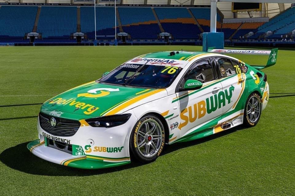
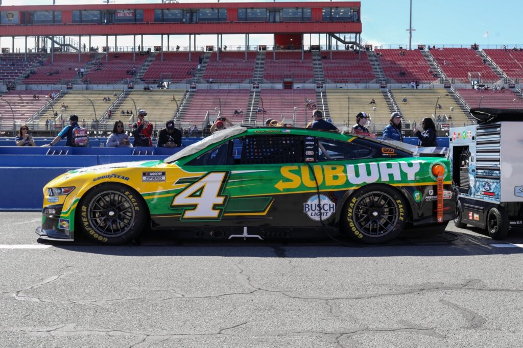
CRAILL: HOT – WAS this one of the surprises of the year? Not only landing Subway (we assume thanks to the Coke Connection) for the first few rounds, but executing such a neat looking car in the process? This is so far removed from the absolute rubbish that was the Team Sydney dayglo Yellow last year that it’s not funny. One of the best this year.
PS, Walker trying to sneak in a comparison to a NASCAR Subway livery when this should be compared to Garry’s scheme from last year. Different league. Fact.
WALKER: MEH– YES, it’s good to have Subway involved, however… you know above where I praised the contrast between black and white on the Percat and Pye cars? Do you know what doesn’t have that level of contrast? Yellow on white. Jeff Grech used to have a thing called the “Back Straight Test”, where he would try to read the side of the race cars going down the back straight at Sandown. While it might look horny sitting still in the middle of a football paddock, driving fast on a race track, I reckon the yellow will get lost in the white. Maybe the plan of attack is to have the car stationary at all times, which in that case, it is pure genius. Make mine a footlong meatball on Italian herbs and cheese. No lettuce, please.
PPS, Dear Richard, I’ve included Kevin Harvick’s Subway Mustang NASCAR for proof that the Subway CI document extends to having yellow and white on green, a combination that is certified HOT….
CAM WATERS’ MONSTER MUSTANG
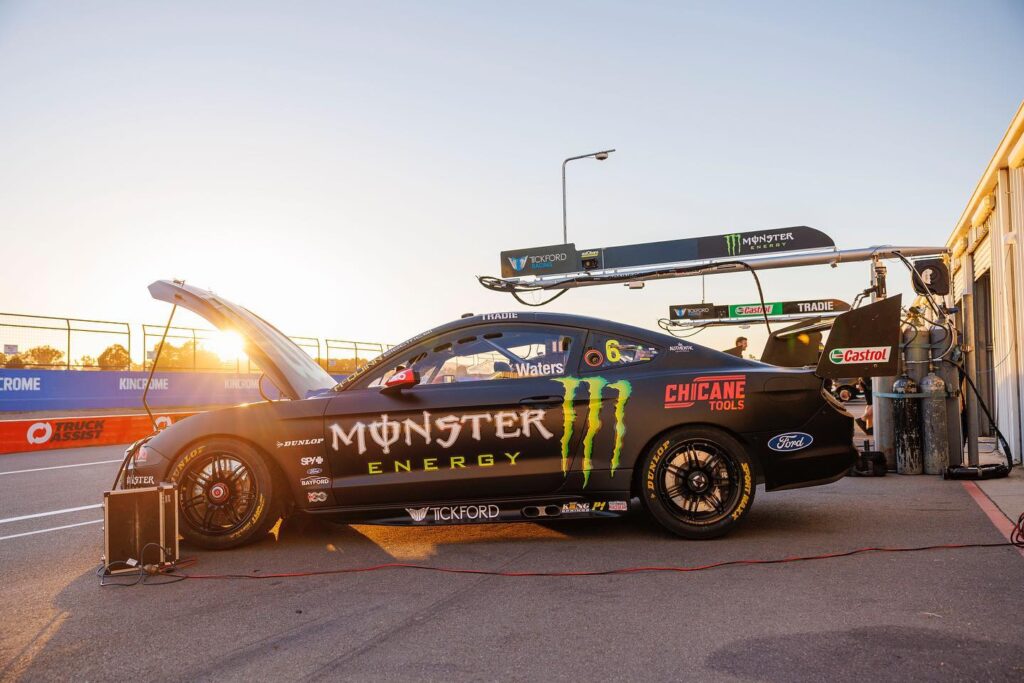
CRAILL: HOT – THIS is hot, but in the same way that a three-day-old takeaway you’ve just reheated in the microwave is hot: It might have the temperature but ultimately it’s probably not going to be the best meal you’ve ever had. Monster sponsorship means much the same livery each year. Fortunately it’s a good ‘un – but someone should tell them change is as good as a holiday.. Good pic though!
WALKER: JUST ABOUT HOT – BY being sponsored by a company that has the same livery on all of its race cars around the world, it means you don’t need to pay a graphic artist a retainer. Smart operating. It looks good and would have been HOT in the first few seasons we saw it, but its ultimate wow factor is wearing off.
SHELL V-POWER RACING
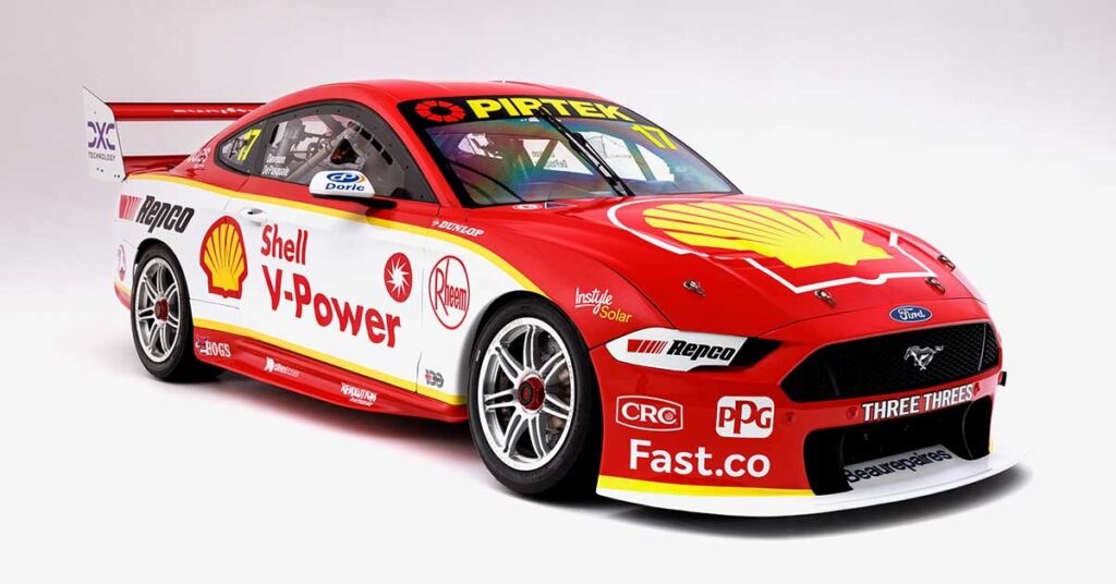
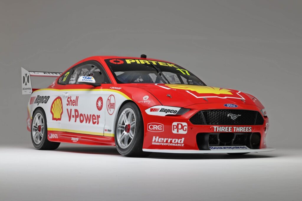
CRAILL: HOT – IN a similar story to the Monster Mustang, DJR keep with more of the same in 2021 and you can’t blame them, really: this Shell Scheme introduced at the start of the Penske era is now every bit as recognisable a Dick Johnson livery as anything the storied team has produced in the past. So it’s a good livery, sure, and the cars stand out.. but while we don’t endorse change for change’s sake, it’d be nice to see this evolve moving forward..
WALKER: MEH – The livery itself in isolation is HOT. What is NOT, is the fact that this is the sixth year in a row we’ve been served up the exact same thing. A whole week of chicken nuggets sounds great until you get to Saturday, and could really go a cheeseburger. The team isn’t tethered to Roger Penske anymore, and Shell isn’t attached to the livery in some Monster Energy scenario. This now shares the prize for the longest-serving DJR livery. Remember the Retro Round where they dressed the team’s Falcons as red Sierras with gold wheels? That was so damn HOT, but such a long time ago…
RED BULL AMPOL RACING
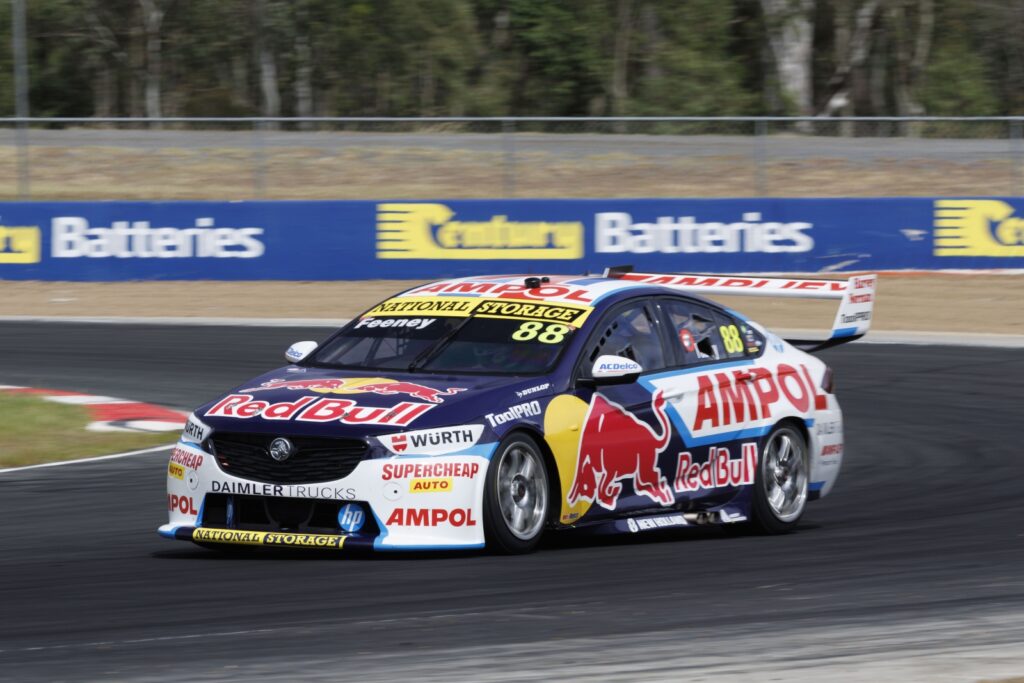
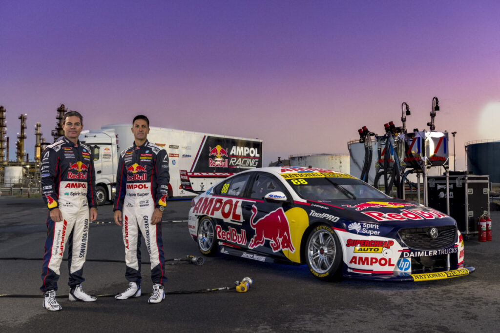
CRAILL: WHAT – A VARIATION of the 2021 theme but better for Triple Eight. There’s more white, less clutter and just an overall cleaner look in a livery that has to balance a whole heap of big-ticket, blue-chip brands and somehow manages to find the space to do just that. It’s not a truly great livery because of that very reason, but it’s an improvement on last year’s to my eyes and that’s all you can do.
WALKER: WARMER THAN LAST YEAR. Without a side by side comparison, you would think that it’s the same as last year. But the devil is in the detail – by taking some of the livery bells and whistles out (2022: left, 2021 right) it’s less cluttered. Also, by taking the light blue line ahead of the AMPOL on the car’s flanks forward, that area has been opened up with more white, giving it a less claustrophobic feel. While a blank race car with minimal sponsors on it looks hot, these guys are so uber professional that they don’t have a spare bit of real estate to sell. In this case, the smart kid has had his braces removed, but still didn’t win the beauty pageant.
MARK WINTERBOTTOM’S IWRIN COMMODORE
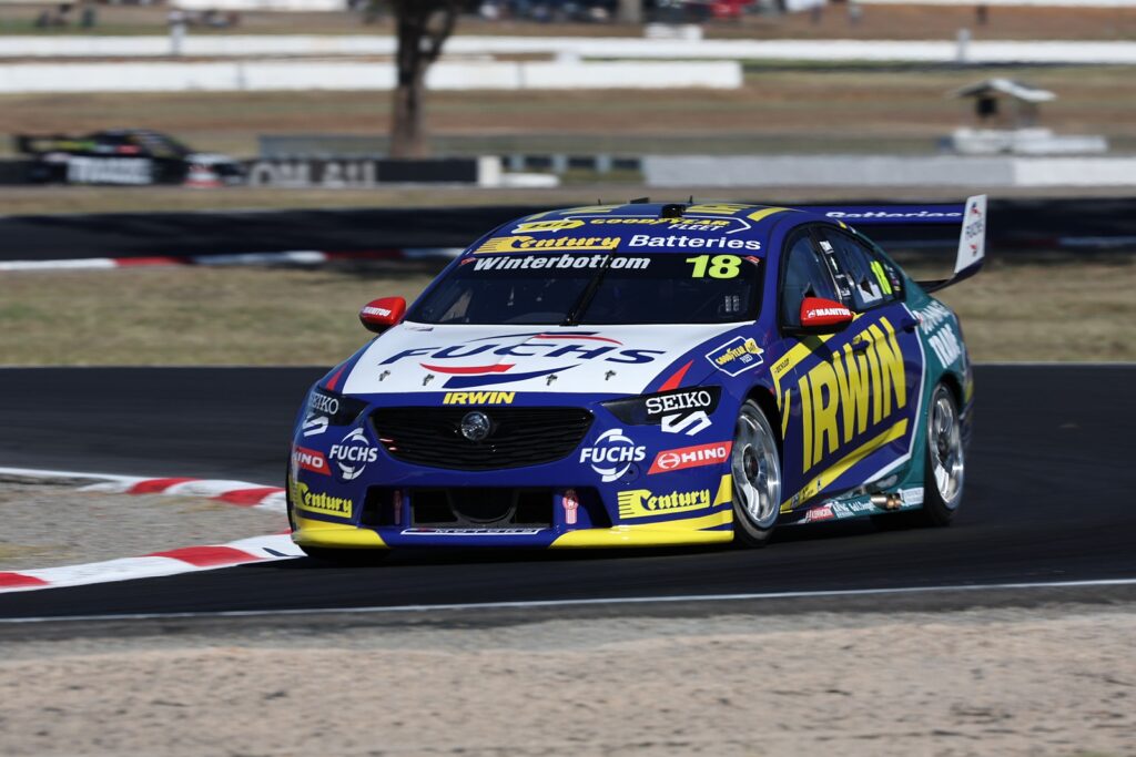
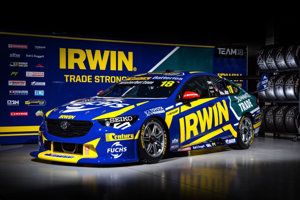
CRAILL: NOT – I AM giving this a NOT because I don’t think it works as well as last year. The white on the bonnet takes away the purity of the bold Blue & Yellow from last year, as does the Bunnings green on the back. Great that Car 18 has more support, but it comes at the cost of a cleaner livery.
WALKER: MEH, COOLER THAN LAST YEAR – If you isolated the back half of the car, I would be 100 per cent on board as HOT. The Bunnings green with the blue and yellow works. Clearly, FUCHS has requested their real estate on the bonnet take on their corporate colours, which is totally understandable. However, by doing so, it detracts somewhat from the slick overall scheme from last year (right).
THOMAS RANDLE’S CASTROL MUSTANG
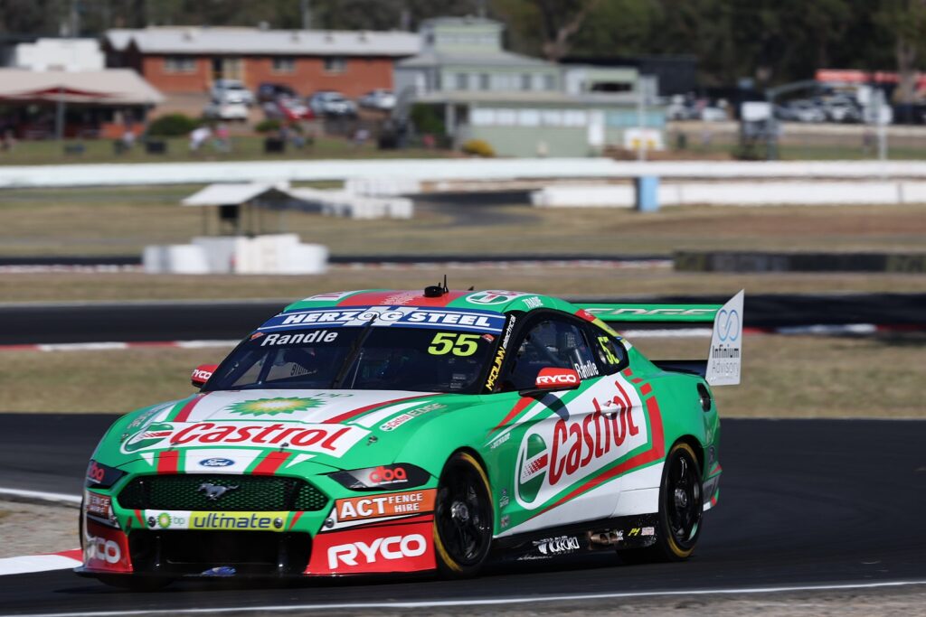
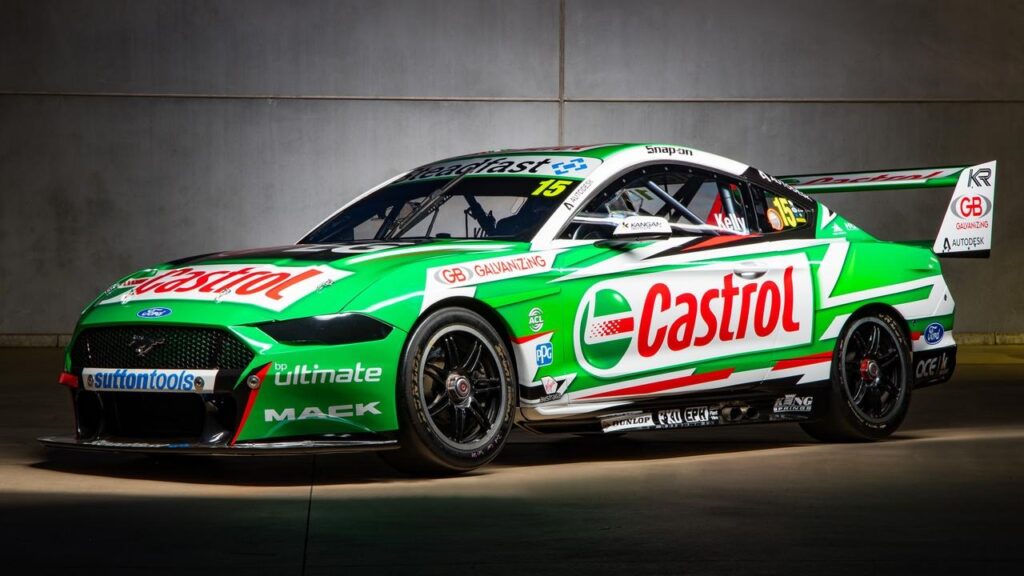
CRAILL: HOT – YOU WOULD have to be a right proper idiot to stuff up a Castrol livery and fortunately Tickford’s people have done a good job here. The side of the car works better than the Kelly car we last saw and harks back more to the LP glory days. It’s not the best Castrol livery ever, but it’s a good Castrol livery and that’s enough for me.
WALKER: MEH. THE MOST recent reference point for a Castrol Mustang livery is Rick Kelly’s example from a couple of years ago. The main issue I have with the 2022 version (left) is that it has gone a bit heavy-handed on the red graphic elements, which takes the attention away from the red writing of Castrol. Ricko’s more subtle green and white arrangement, with minimal red accents, is just easier on the eye. Sometimes less is more.
BOOST MOBILE RACING
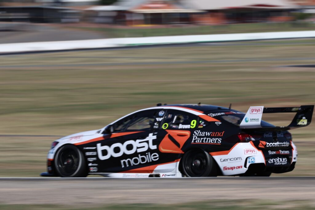
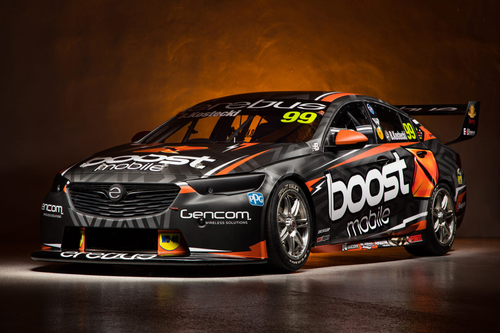
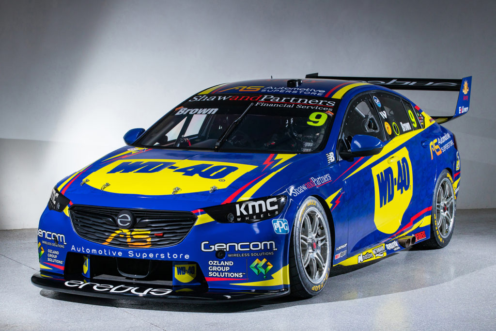
CRAILL: Single car? Mild. Two-car photo? HOT – EREBUS have done a nice job integrating the Boost Orange and Black with the White of their existing partners in what is a cohesive effort for their return to a team running identical liveries on both cars. Sure, Boost and Truck Assist need to get together and talk colors, but this works pretty well, especially when the two cars are lined up together. Very cohesive. Apart, Kostecki’s #99 car was probably a better stand-alone boost livery last year, but that was before they had to work in all the other partners into a two-car team. I miss the WD-40 car. I love WD-40. Two cans down this year already, don’t you know.
WALKER: MORE MEH. The below side-by-side images show what Erebus was capable of 12 months ago, where both genuinely were HOT. This year’s attempt just doesn’t excite me in the same way. If you had this new look on a Commodore in the 2004 V8 Supercars Championship, it wouldn’t look out of place. Also, I am a card-carrying member of Team No Black Wheels.
ANDRE HEIMGARTNER’S BJR COMMODORE
CRAILL: NOT – ONCE again BJR have managed to MacGyver their way into a host of sponsors for another season and they’ve worked hard to incorporate a livery that needed Red, black, yellow, white and others on Andre’s car. Sadly, I’m not sure if it works, honestly – the Club Cadet signage on the bonnet doesn’t tie in at all with the red and black wedges of the R&J stuff on the side – but you can only work with the signage you’ve got and it’s better than an all-white car. Black wheels work and yes, I added this bit after Walker wrote his words.
WALKER: NOT – TEAM NO BLACK WHEELS! Ok, now we’ve got that out of the way, the rest of the car doesn’t really do a whole heap for me. It’s a bit of a balancing act between all of the different competing interests on the car.
JACK SMITH’S BJR COMMODORE
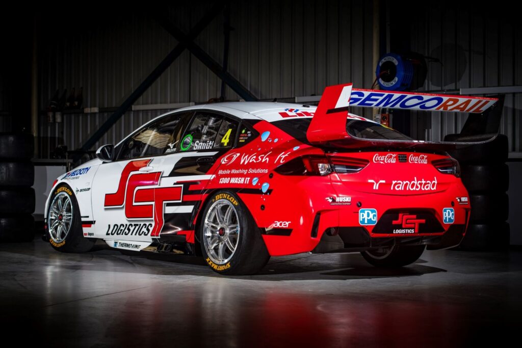
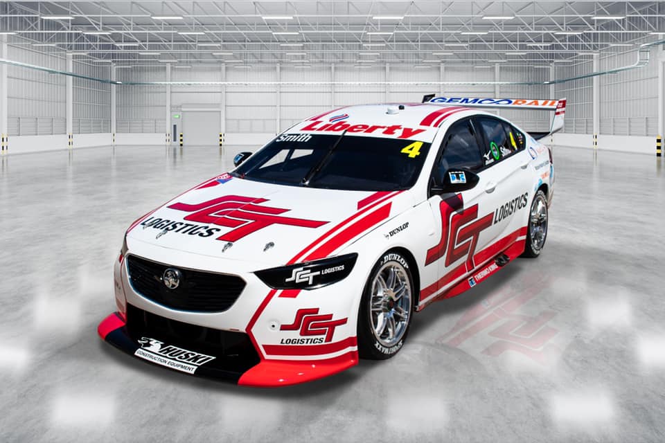
CRAILL: NOT – IT SHOULD be hard to miss when you’ve only got Red, White and Black to work with so we all thought we should like the SCT Logistics Commodore. And yet.. while the front works the rear half just seems overly busy with a lot of design for design’s sake. It’s far from inoffensive and it’s not in this section because it makes me sick – but a bit of a mixed bag for BJR this year.
WALKER: NOT – IT’S TOUGH. Last year’s livery, right, might have looked at home on a Commodore repmobile, parked outside a country motel on any given night. This year they chose to have a big swing at a livery. I think the actual problem here might be the SCT logo – it’s clearly designed to run together, which might be fine for the side of a truck or a train, but it doesn’t translate well to a race car. Then placing that run together logo adjacent to the black and red of the livery just makes it all a bit hard to read. Should you change your company’s logo to appease some dickhead on a website? Probably not. As you were.
BRYCE FULLWOOD’S OH MY GOD WHAT HAVE THEY DONE BJR COMMODORE
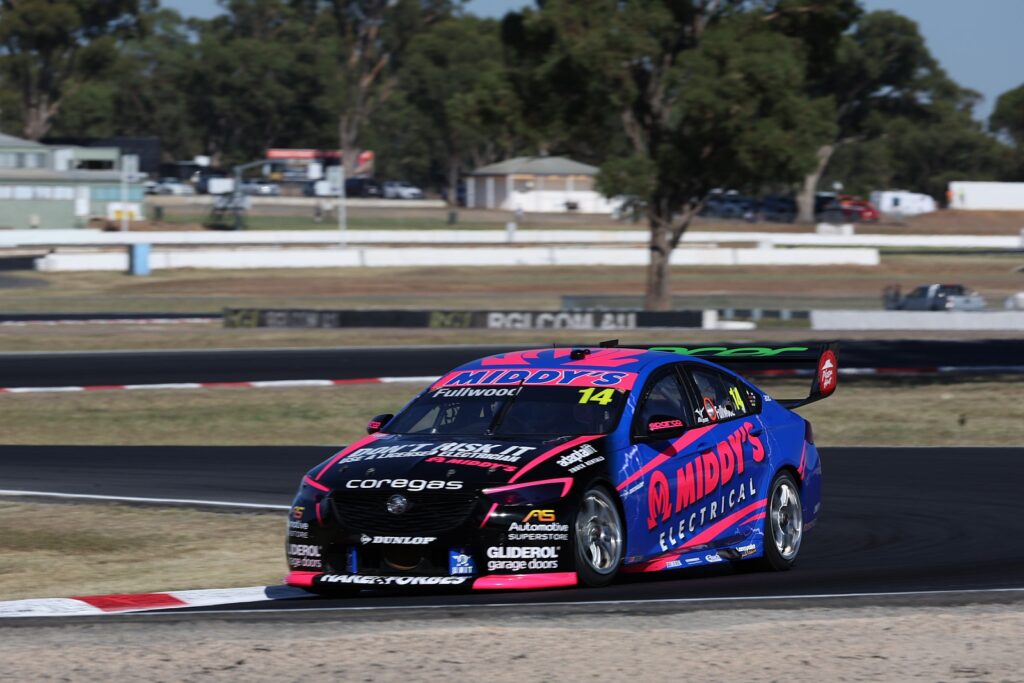
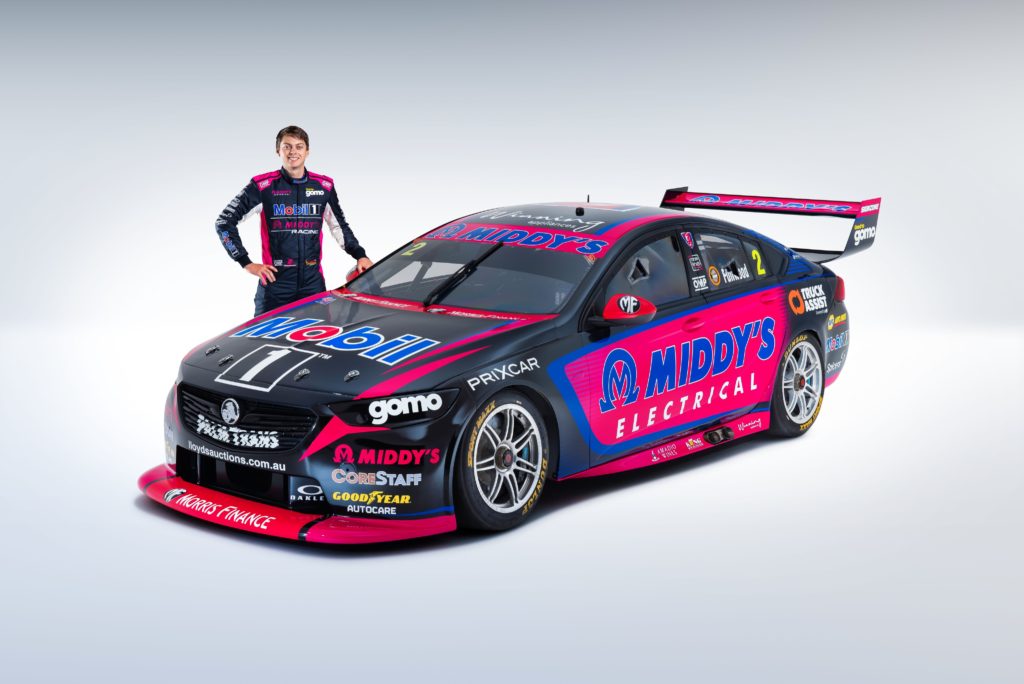
CRAILL: WHAT, but with a touch of HOT because: Reasons – THIS is the car the rankings are designed for, with most of our crew uncertain if they love it to pieces or hate it with a passion – but we do know that the grid would be much less interesting without the Middy’s machine on it. Liveries shouldn’t be boring, and they should get people talking, whether you like the aesthetics or not and this falls bang into that category in my opinion.
WALKER: NOT. SOME SAY, the pink vinyl is radioactive, and you can see it with your eyes closed. Otherwise, it has lightning bolts on it – this isn’t the tattoo competition at the Purga Creek Bike Show, you know. Also, it appears that different designers had a crack at the front and rear of the car, but they didn’t really communicate with each other a suitable way to marry the two halves. For reference, last year’s car, right, was HOT.
Thanks to Doric for their support of the TRT Power Rankings in 2022. If you aren’t getting your own way in your own Power Ranking voting, you might consider the EPEC door lock – a digital locking solution so you can keep your mates out of the room where the computer is. Check it out at the link below and use the promo code ‘year18’ to save sweet, sweet dollars.
Richard Craill (administrator)
Working full time in the motorsport industry since 2004, Richard has established himself within the group of Australia’s core motorsport broadcasters, covering the support card at the Formula 1 Australian Grand Prix for Channel 10, the Bathurst 12 Hour for Channel 7 and Porsche Carrera Cup & Touring Car Masters for FOX Sports’ Supercars coverage. Pretends to be a PR guy / Journalist and sometimes photographer to make ends meet when not yelling at a television in a padded room.