

Power Rankings: The Livery Class of 2023
The Supercars liveries of 2023: black is the new black, and less is definitely more.
Here, The Race Torque team have been locked in a room and had to rank this year’s livery set from best to worst.
Agree? Disagree? Hit us up on the socials @theracetorque with your hot take!
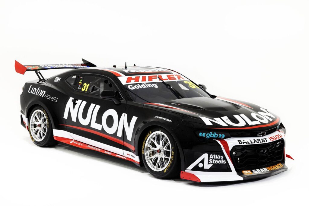
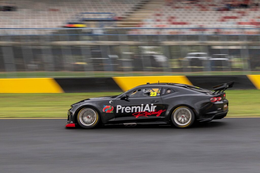
Nulon/PremiAir Hire
Exhibit one shows that simplicity works.
Remember the retro round, when they threw simple old-school liveries on the cars, and everyone frothed?
Big contrast between the black and white with the red highlights simply doing that – adding a highlight, but not a distraction from the branding.
Also, this ranked the highest because it was Editor Craill’s personal favourite, and paying homage to The 12th Man, we’re going to do this as a team, and do it his way…
VERDICT: Would have looked great in the 1990s, and we’re here for that. A better Back in Black than the overhyped, overplayed ACDC song. This thing looks ace.
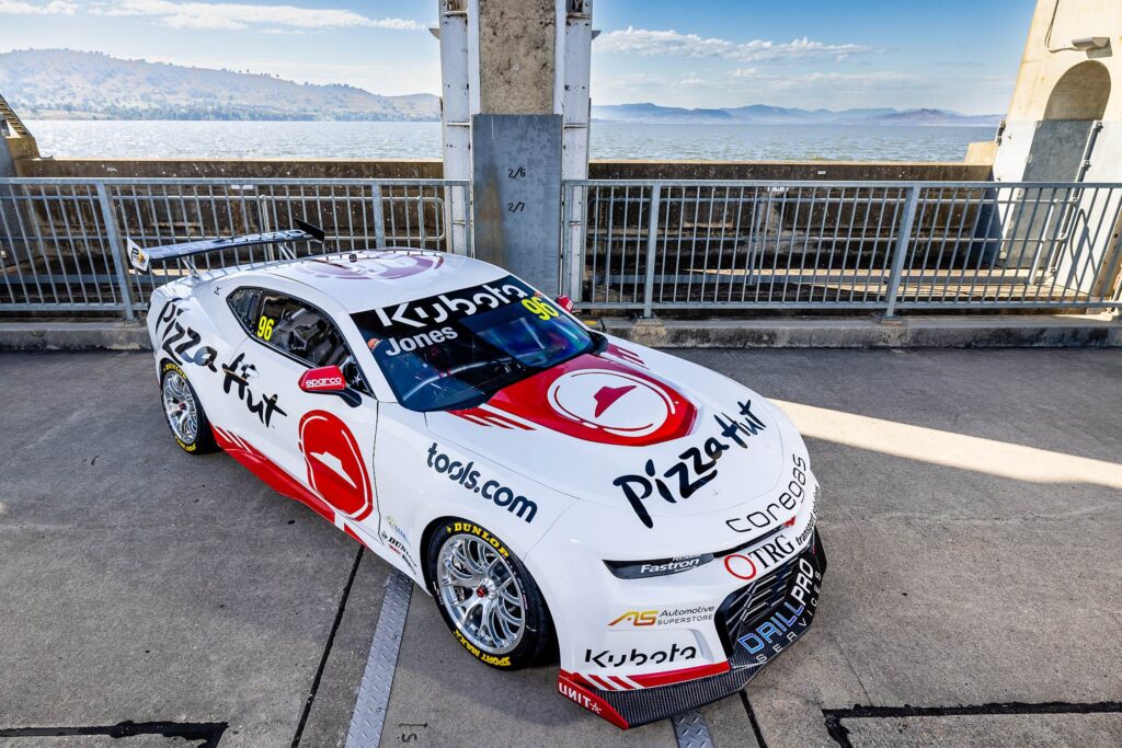
Pizza Hut
Exhibit two – more simplicity.
Red, white, dirty great Pizza Hut branding, and that’s it. Crystal clear.
Also, this brings back memories of the Pizza Hut all-you-could-eat buffet from when we were fat kids, possibly the happiest place on earth, so this may indeed cloud our judgement.
VERDICT: We hope no one ‘Hits the Hut Tonight’ to keep this looking as fresh as it is.
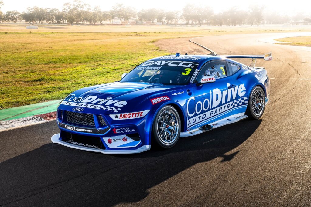
CoolDrive Auto Parts
Ever since they first chucked these similar hues on the first in-house CoolDrive Mustang a couple of years ago, this look has been thoroughly hornbag.
When applied to a better-looking pony, it is a stunner.
VERDICT: The little team that could continues to punch above its weight.
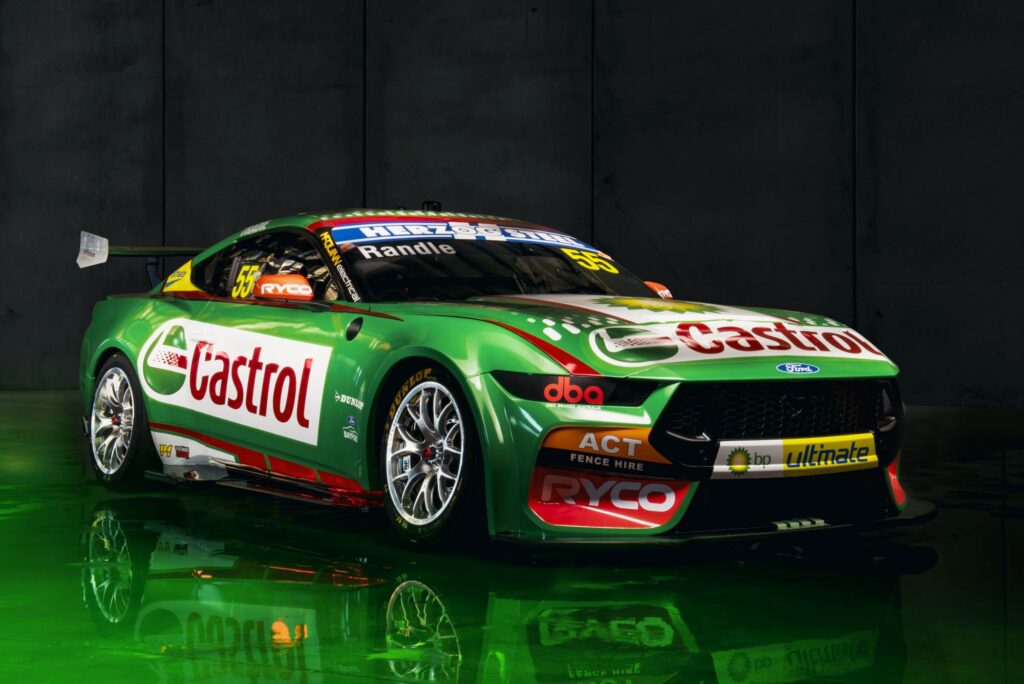
Castrol
Remember last year when they threw a massive livery at the Castrol Mustang, and it looked like an explosion at a pizza shop?
Once again, by stripping the bells and whistles, the simplicity pops.
Also: blank front and rear quarter panels add to the neatness, but probably not to the Tickford bank account.
VERDICT: If you stuff up a Castrol livery, you’re insane. Tickford are not insane.
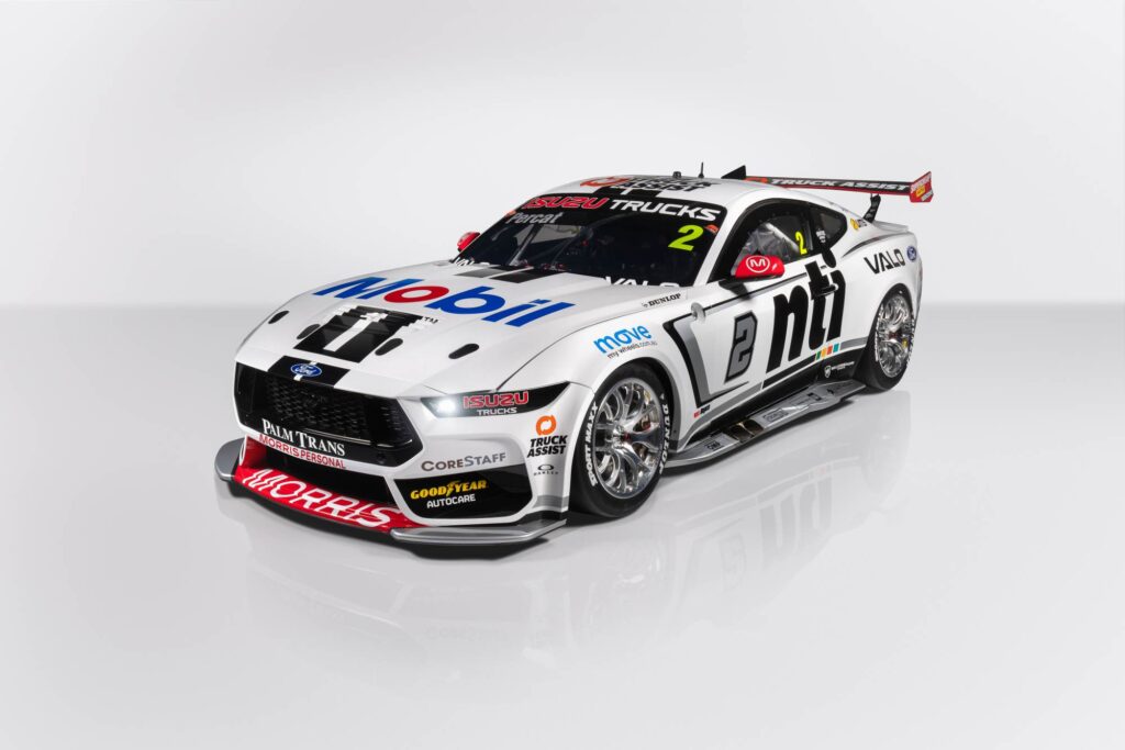
NTI
The adaptation of the recent Walkinshaw Andretti United livery on the Mustang just works nicely, with this one edging out some staunch competition just behind the lead pack.
Once again, there’s no better contract than NTI black on white.
VERDICT: Put a lion and the side and it’s this team, but in 1995. Which is good.
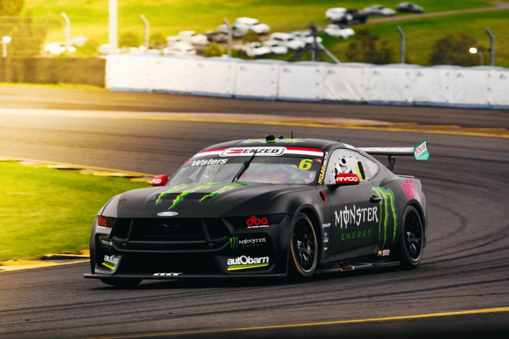
Monster Energy
You could have placed a bet on this livery happening, but you would have had to be satisfied with a $1.01 return on your investment.
Matte black looks mean anywhere, and the Monster motif is tough.
Like the Castrol look, the empty front quarters add to the aesthetics.
VERDICT: DJR will get angry for judging this differently to their livery but they’re our rankings and we’ll do what we want.
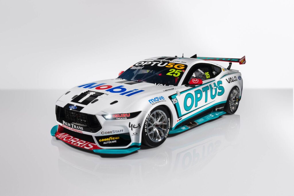
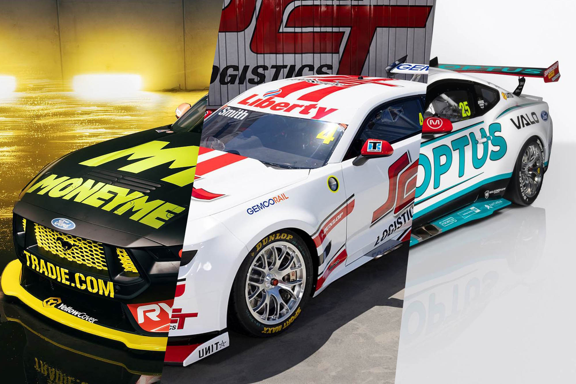
Optus
Looks sharp on paper or in a studio shoot, but will the Optus teal be lost on the white background at speed?
VERDICT: The car Port Adelaide AFL fans will love? We’re split on this internally, but Craill won the #1 vote so like the benevolent dictator super bloke he is, was big enough to give ground on this one.
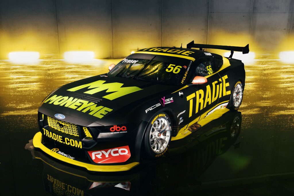
Tradie
If we were the mediator in charge of final livery signoff, we would get the Tradie people together with the Moneyme people, and tell them a little white lie: they only make one colour of yellow vinyl.
This livery should have topped the pops, yellow and black cars always look awesome.
Two types of yellow and black not so much.
So damn close to brilliance.
VERDICT: ‘So Damn Close to Brilliance’ would be the name of Tickford’s first Album. Close, but no cigar. Also: Just say no to yellow grille’s.
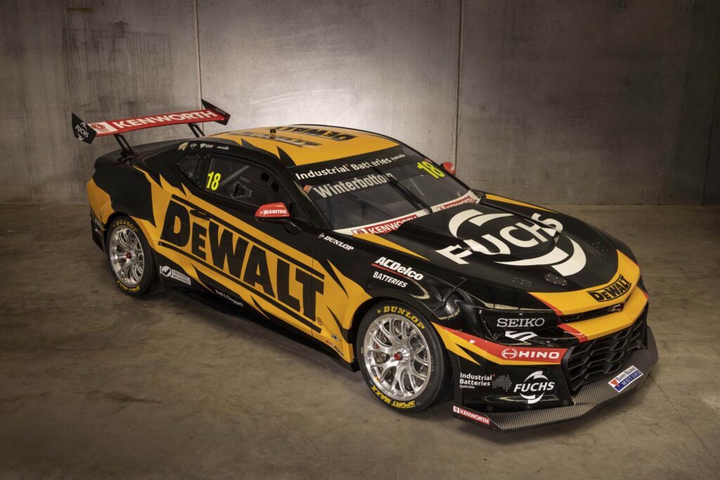
DeWalt
Yes it’s yellow, yes it’s black, so therefore it should rock.
But this one is just… lacking a little.
Maybe there is too much livery treatment added that detracts from what is possible?
In a year when less is more, this started out with more.
VERDICT: Arguably not as good as the DJR cars, but ranks higher because they had a crack at doing something different, even if we don’t think it quite worked.
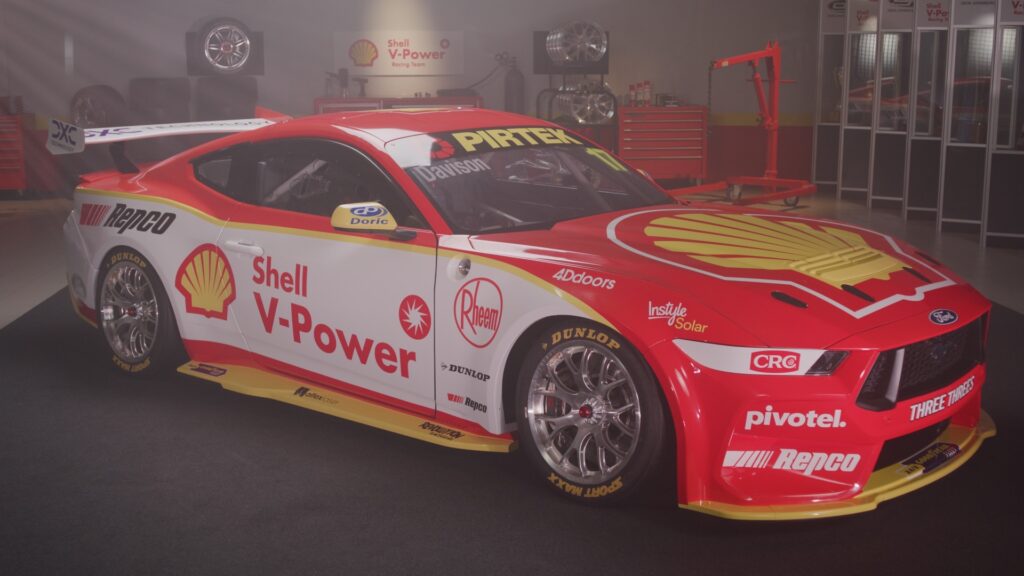
Shell V-Power
Yes, nice. It’s a Shell Ford. It looks nice. Clean. Competent. It’s good.
But it’s another version of the same thing we have been served for the past eight years.
Could they do better? We could take a guess at the possibilities, but at this stage, we’ll probably never know…
VERDICT: RP is gone but the Penske way remains, even in the ways where it’s not as good a thing as it should be. So much potential for an incredible Shell livery ignored.
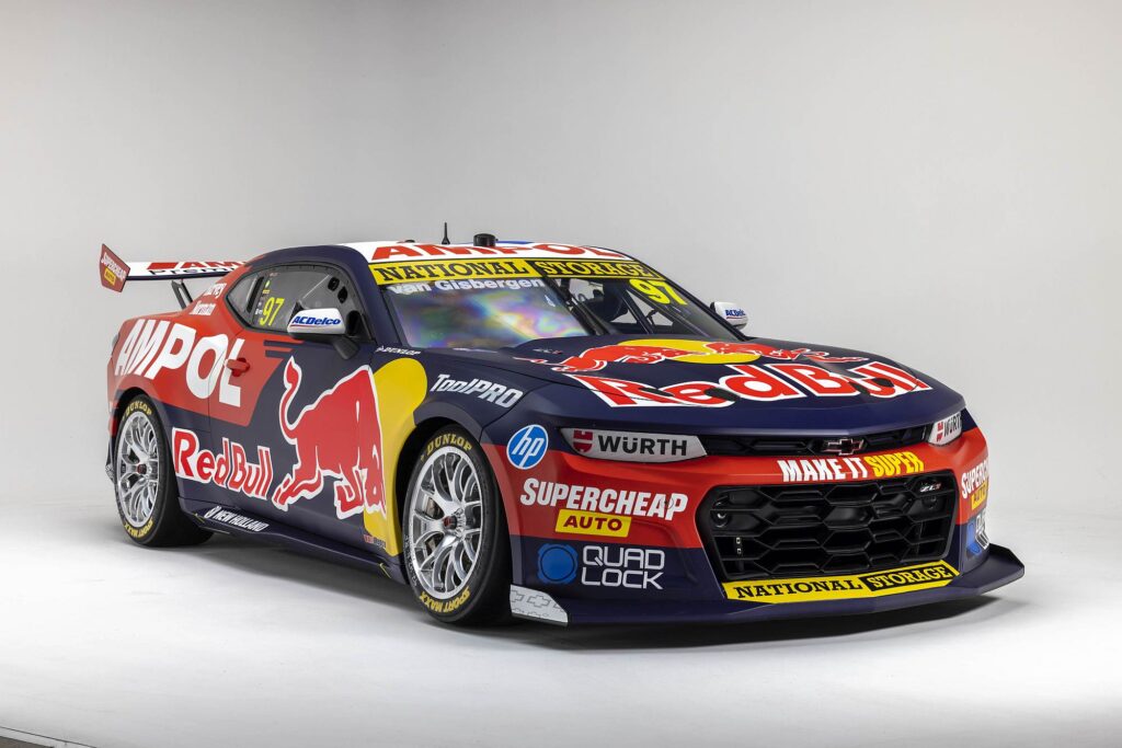
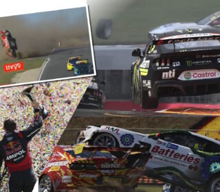
Red Bull/Ampol
The initial reaction was: ugh.
On second looks: hrmm, ok.
When it was on the track: you know what, it’s ok.
Triple Eight doing Triple Eight things, with an embarrassment of riches caused by having oversubscribed panels, with many blue chip companies all putting in big wedge to have their colours featured.
It won’t win the beauty contest, but the racecar with the bejewelled frock is alright with it.
VERDICT: Are we being too hard on this team here? Are we penalising success in commercial sales? Yes, we probably are. Probably our most polarising nomination but hey, at least we’re throwing around some opinions and not just sitting on the fence, or making stuff up. Well, at least the fence bit..
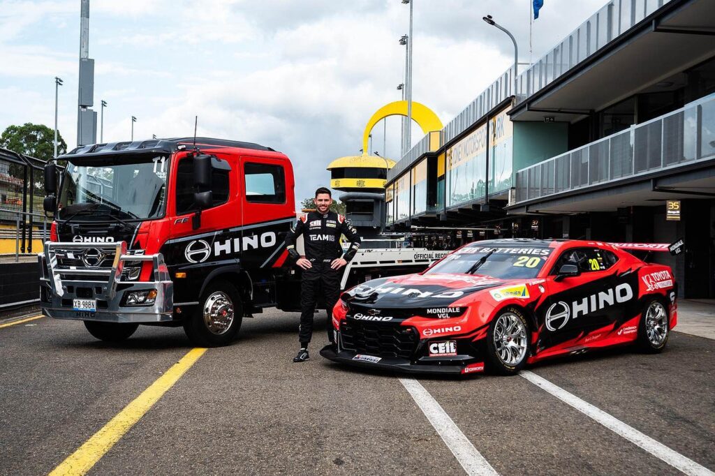
Hino
It’s non-offensive, but like last year, it’s the mental hurdle of a one-off livery that lose this bad boy points.
Handily, if anything ever goes wrong with the power steering, car 20 has its own personalised tow truck.
VERDICT: Honestly, we spent more time discussing whether Team 18 had moved on from their Power Steering issues than we did this reasonably competent, if uninspiring livery.
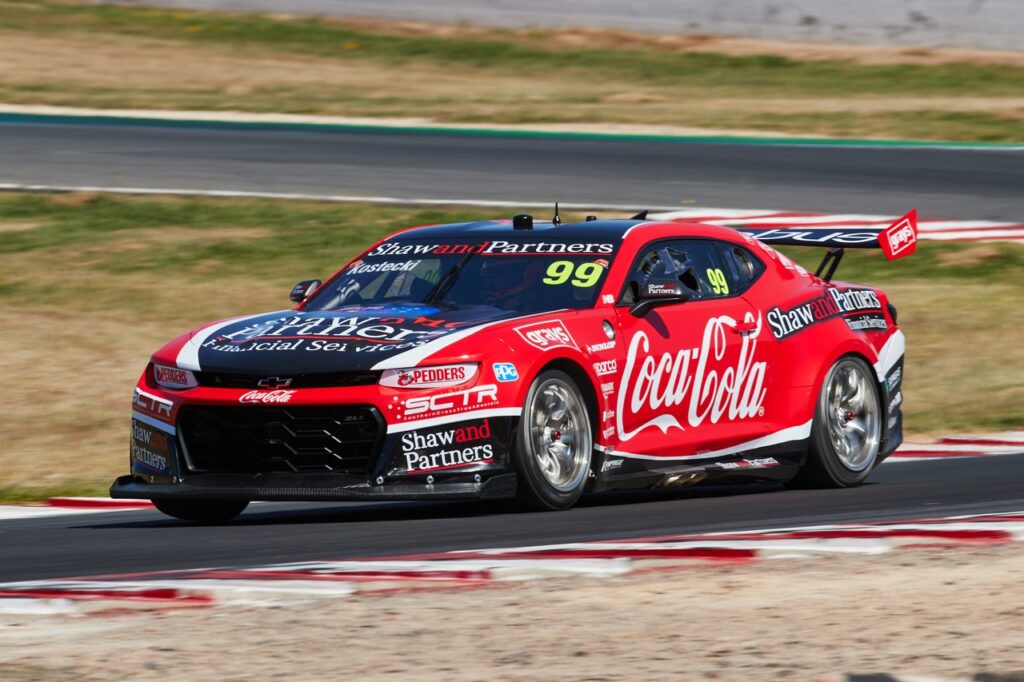
Coca-Cola
The Coca-Cola portion: yay.
The part that loses it points is the Shaw and Partners Financial Services bit.
It’s nobody’s fault, but Shaw and Partners Financial Services is a lot of letters, and a lot to take in when the billboard is screaming past at speed.
It’s simply not as recognisable as say, a Coca-Cola logo.
VERDICT: Needed to channel some mid-90s Wayne Gardner vibes here. Not in terms of shunting into people, of course – please avoid that – but in terms of the iconic Cocadore liveries of that era.
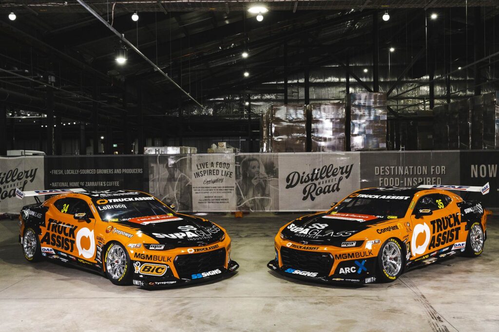
Truck Assist
You know what, the orange and black will be quite distinctive on track, and the Truck Assist branding has better contrast than some previous efforts.
Unfortunately, it loses brownie points from an issue know as Matt Stoneitis, a rare condition the MSR cars developed last year.
It’s great that so many subsidiary sponsors are coming to the party, but it does wind up a tad cluttered.
VERDICT: Less is More is our mantra for Gen III liveries and that’s the only reason MSR sits this low. And we really like the Orange background for Truck Assist, which is a nice change. The problem here is most of the other Truck Assist liveries were also awesome. Tough crowd.
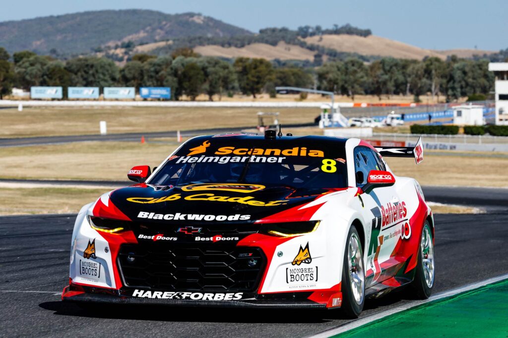
R&J Batteries
Yeah, nah.
It looks mean, but a few little negatives detract from the package, like the Club Cadet clashing with the Scandia.
Also, the R&J Batteries logo is an awkward shape, which is further complicated by a tagline that is hard to read.
VERDICT: Look, we’d had a rough day when we got to #8 and the little details were grating. BJR can’t be helped that their sponsors logos are not conducive to good livery. The front is epic but the sides are meh. Go on, disagree, we’ll probably back you.
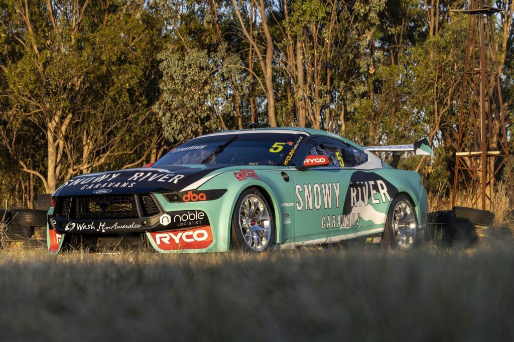
Snowy River Caravans
Another one that looks smart sitting still, but will be hard to read when it’s moving fast.
Like Chaz, teal and white are both at the lighter end of the colour chart, and don’t provide brilliant contrast from each other.
VERDICT: We don’t want to tell these people how to do their job. But having said that:
Adobe Photoshop > Select ‘Snowy River Caravans’ logo > click main menu item ‘Layer’ > Layer Style > Stroke… > Increase Stroke Size +50.
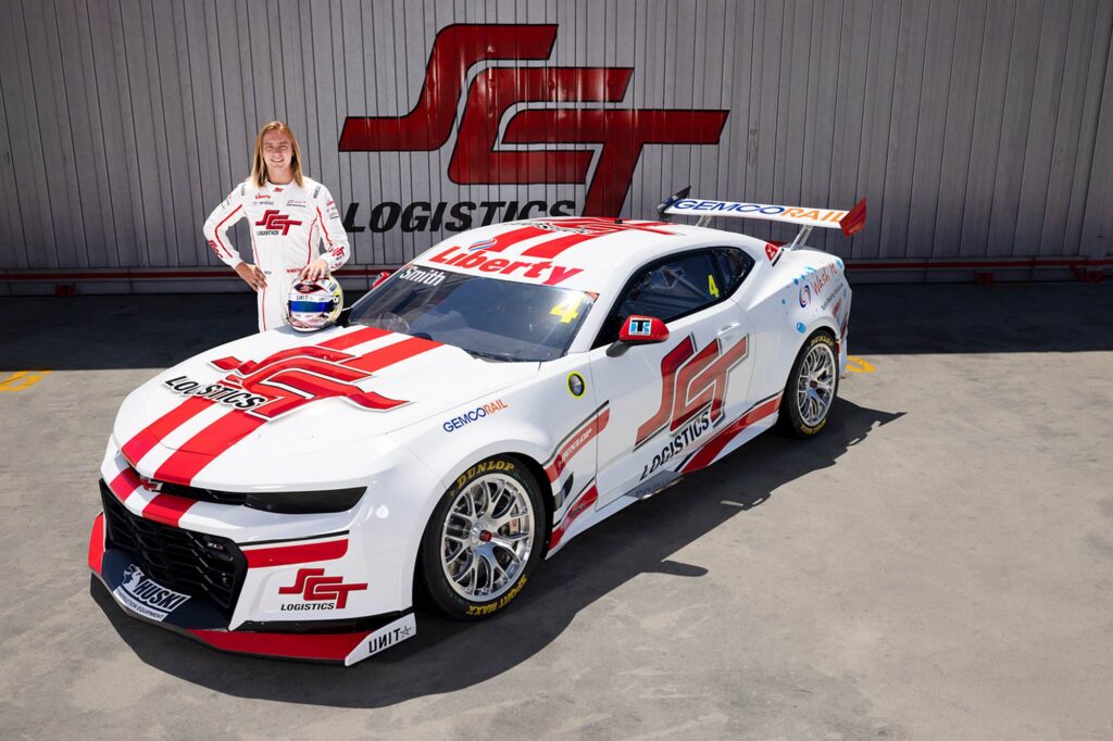
SCT Logistics
We diagnosed the problem last year: the SCT Logistics logo is just bloody hard to read, with all of the letters jammed together, going fast, it’s like the acronym has suffered a nose-to-tail letter-bender.
On a 5km long freight train rolling around the countryside? No problem, you’ve got time to calculate what the logo means.
GT stripes look mean: simply, this would be near the top of the pops with some alternate branding.
VERDICT: Imagine this with a Pizza Hut logo.
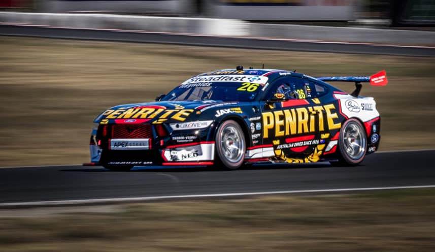
Penrite
There’s a lot going on here, are the red and the white bits entirely necessary?
There have been good Penrite liveries in the past, but again, more in this instance, is not more.
VERDICT: LOOK AT ALL MY BRANDS! LOOK HOW WE ARE BECOMING A POWERHOUSE TEAM WITH GREAT COMMERCIAL SUPPORT. LOOK HOW WE’VE SIGNED ALL THESE GOOD PEOPLE AND ARE PROBABLY GOING TO END UP WINNING EVERYTHING!
To be honest, they probably have a point and if they win Bathurst this year no one will care..
PremiAir Hire
At the time we created this list, somehow, no livery at all beat…
VERDICT: Gen III cars looked best before they got sponsors. It’s a fact. Don’t argue.
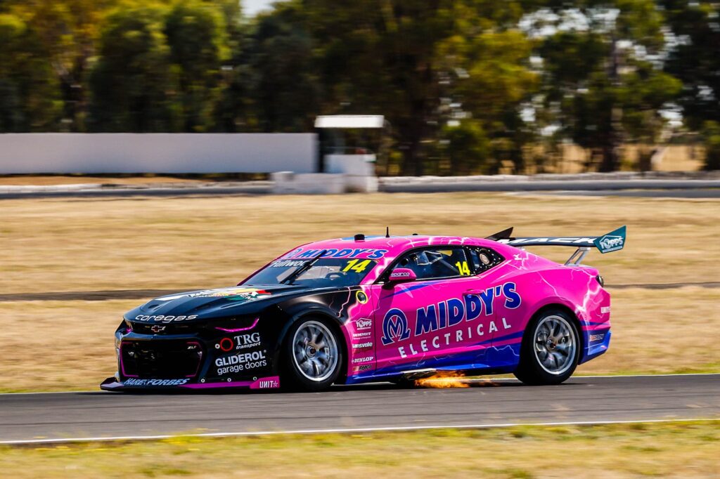
Middy’s Electrical
After being tail-end Charlie on this list last year, the team have doubled down and steered into the skid even harder.
Remarkable.
VERDICT: On the upside, we suppose you won’t miss it.
